A Vibrant Life Counceling
My Role
Research, Information Architecture, User flows, Sketching, Wireframes, Branding, User Interface, Usability Testing, Prototype
Client
Licensed Therapist
Timeline
65 hours
Background
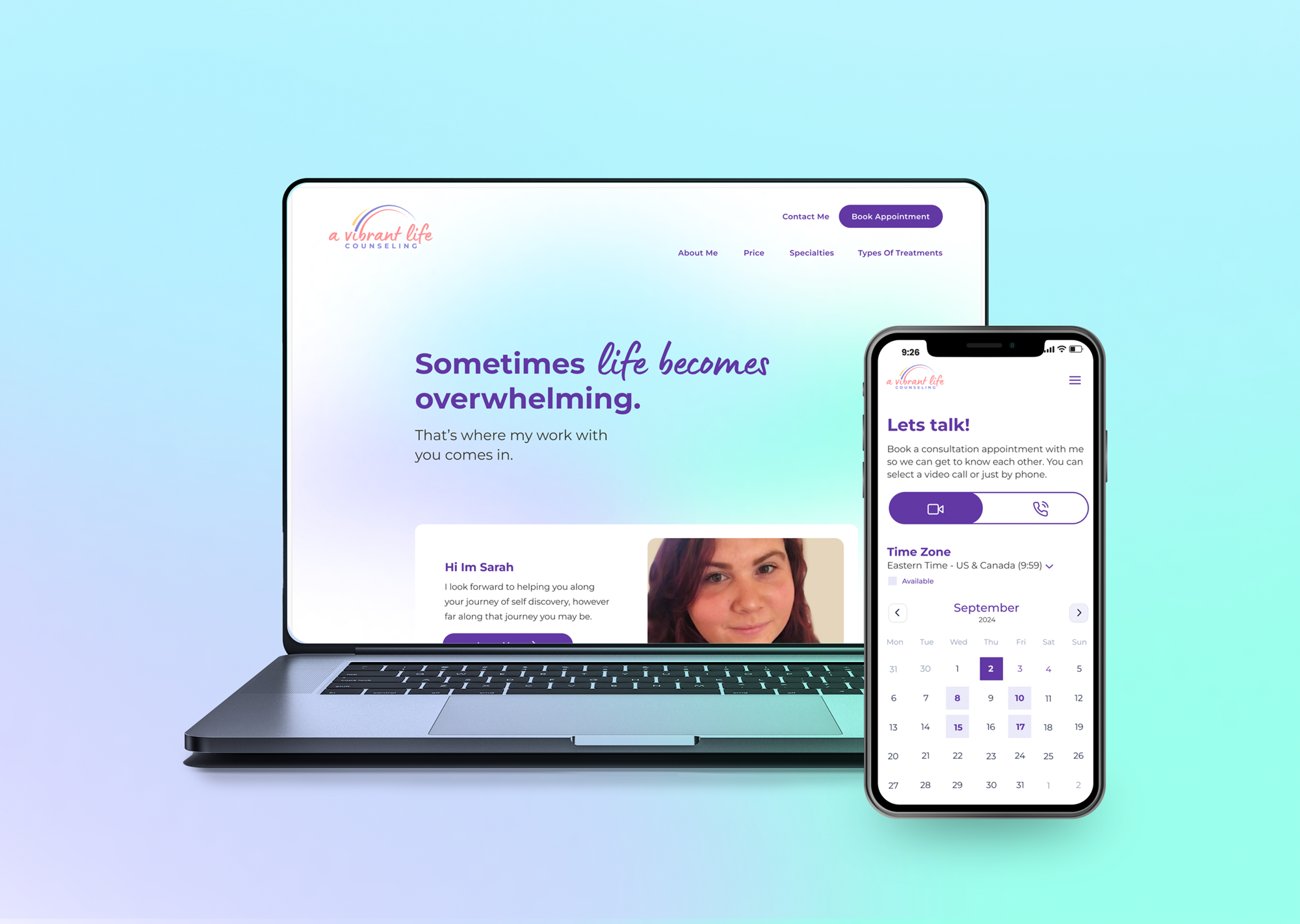
A Vibrant Life Counseling is dedicated to assisting individuals during overwhelming moments in their lives. The website is designed to give users a clear understanding of the services offered by the counselor. The client requested a vibrant design that reflects her personality while also being light and calming. The responsive site includes information on specialties, treatment options, pricing, contact details, and a booking system for appointments.
Empathize
What Were the Research Goals?
The main focus of the project is to help my client achieve her personal business goals. She wants to create a clean and simple responsive website for her business. My goal is to help her stand out from other therapists so she can gain more patients. I will focus on a mobile first approach when designing since most users search on their phone.
High Level Goals and Objectives
- Create Branding for client
- Create a responsive website with a mobile first approach
- Help my client stand out from other therapist
- Create an accessible website for users
- Help users feel good about sharing information
Secondary and Primary Research
Secondary Research
Competitive Analysis
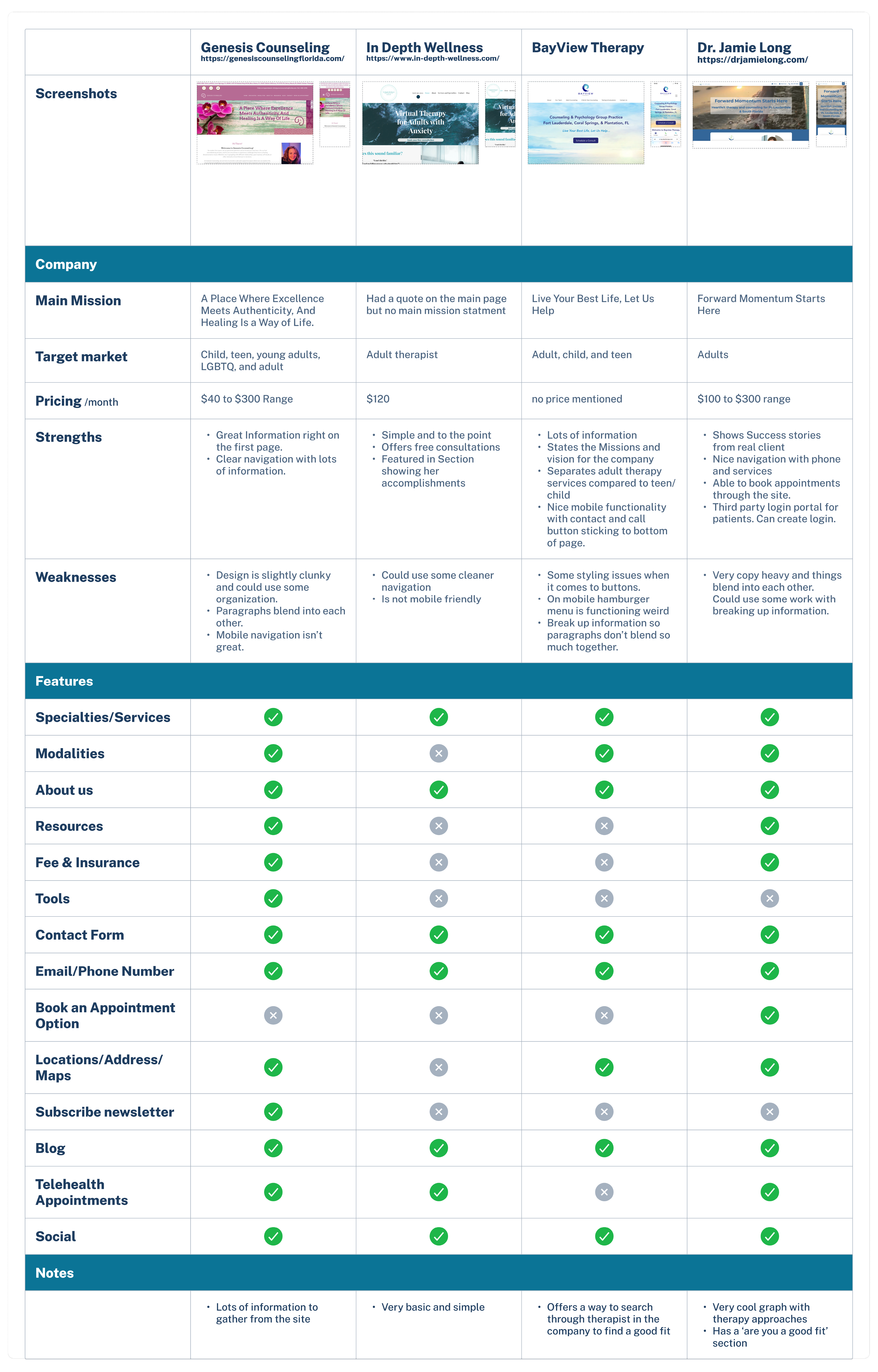
I did some initial research looking over therapist sites and large counseling sites. I was able to get a sense of what others have done. I created a competitive analysis graph to compare a couple sites that I found that my client liked. I was able to compare each and see what most users find on these sites.
Primary Research
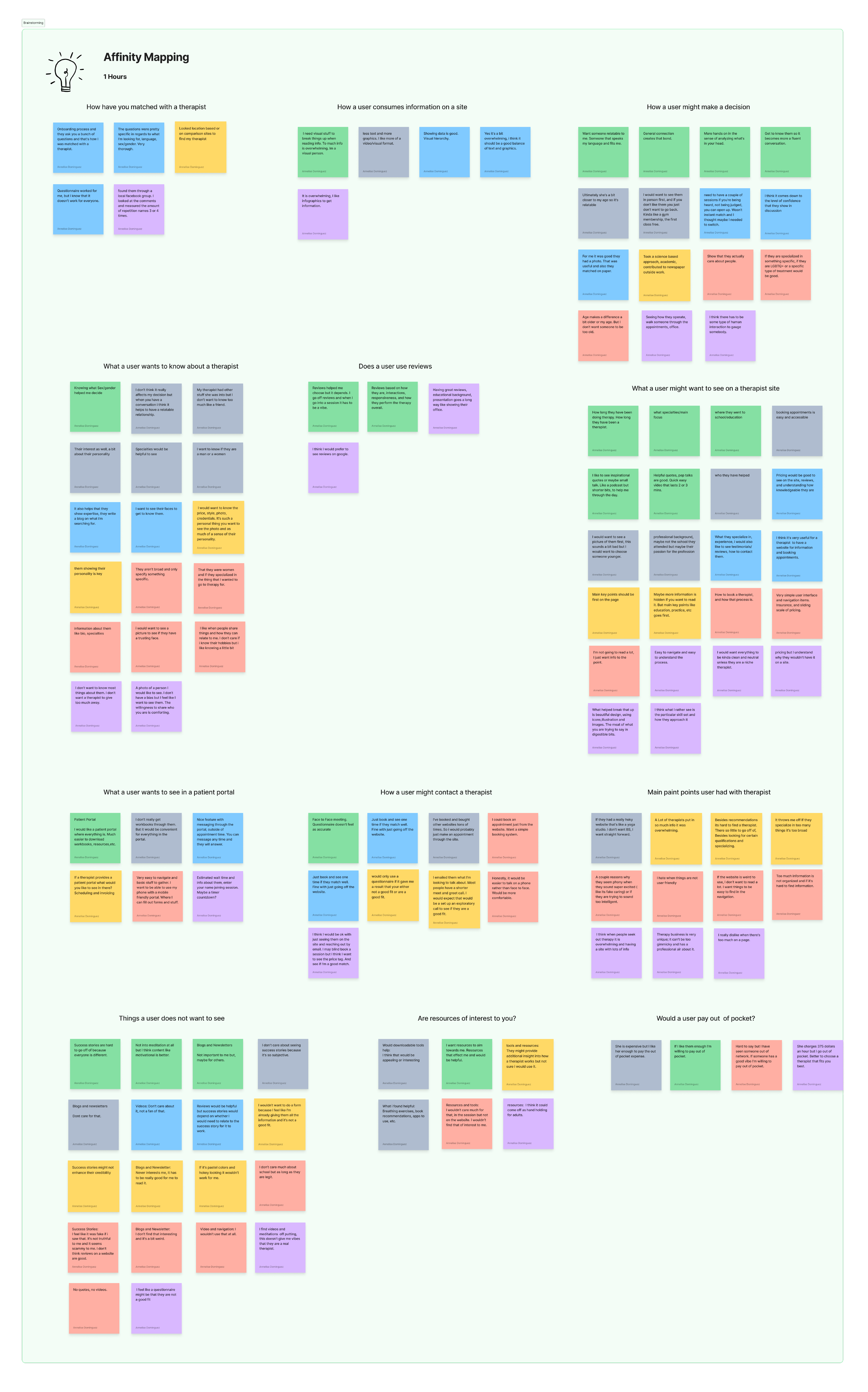
I was able to interview 6 adults to understand what makes a them choose a therapist. After the interviews I created an Affinity Map and created groupings of the findings.
- How a user consumes information
- What they want to learn
- How they like to contact a therapist
- How a user makes a decisions
Define
The Problems
Finding the right therapist can be stressful, a lot of therapists blend together. How can I help my client stand out from all the rest of the therapists and show the skills she can provide to her patients?
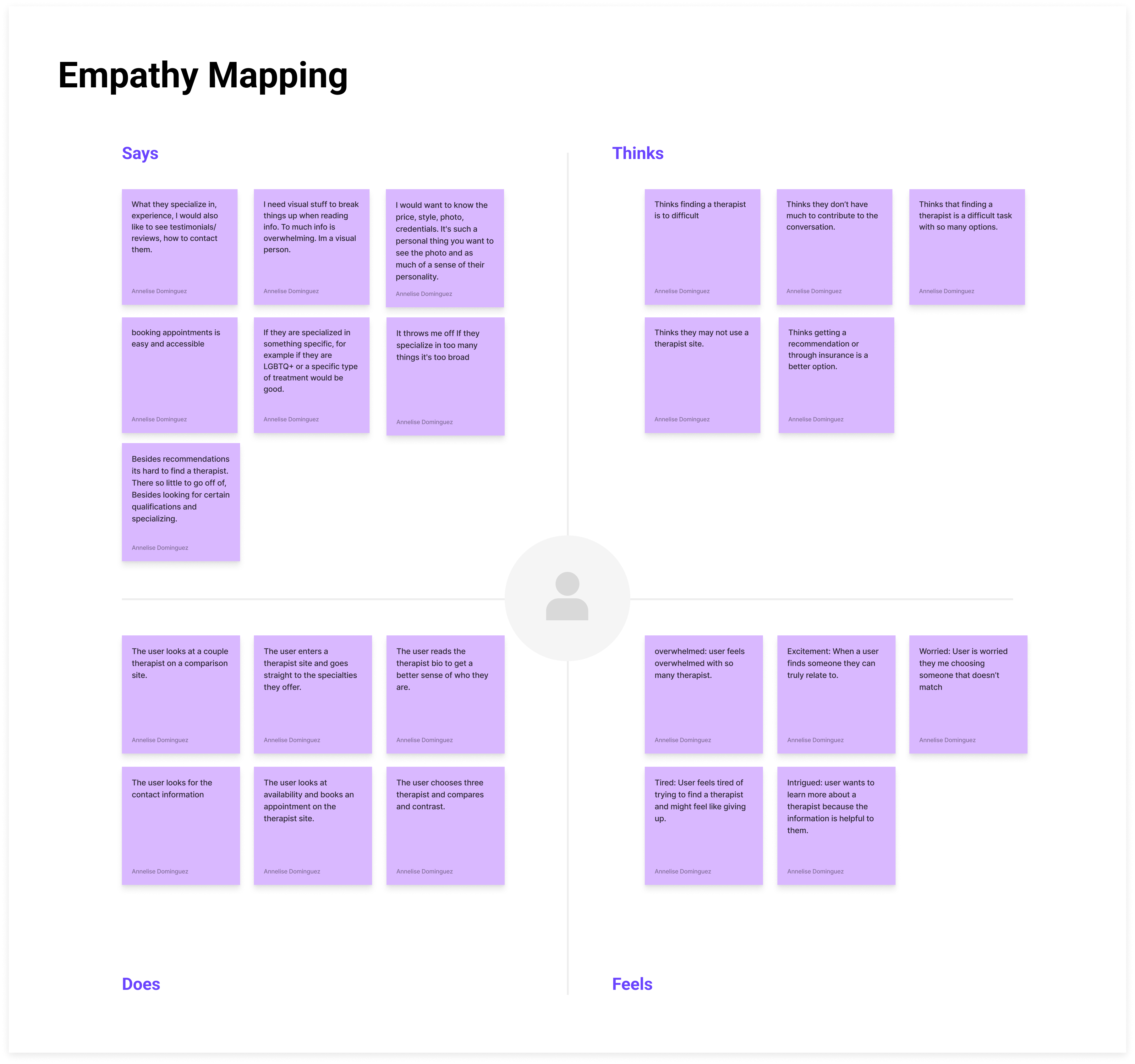
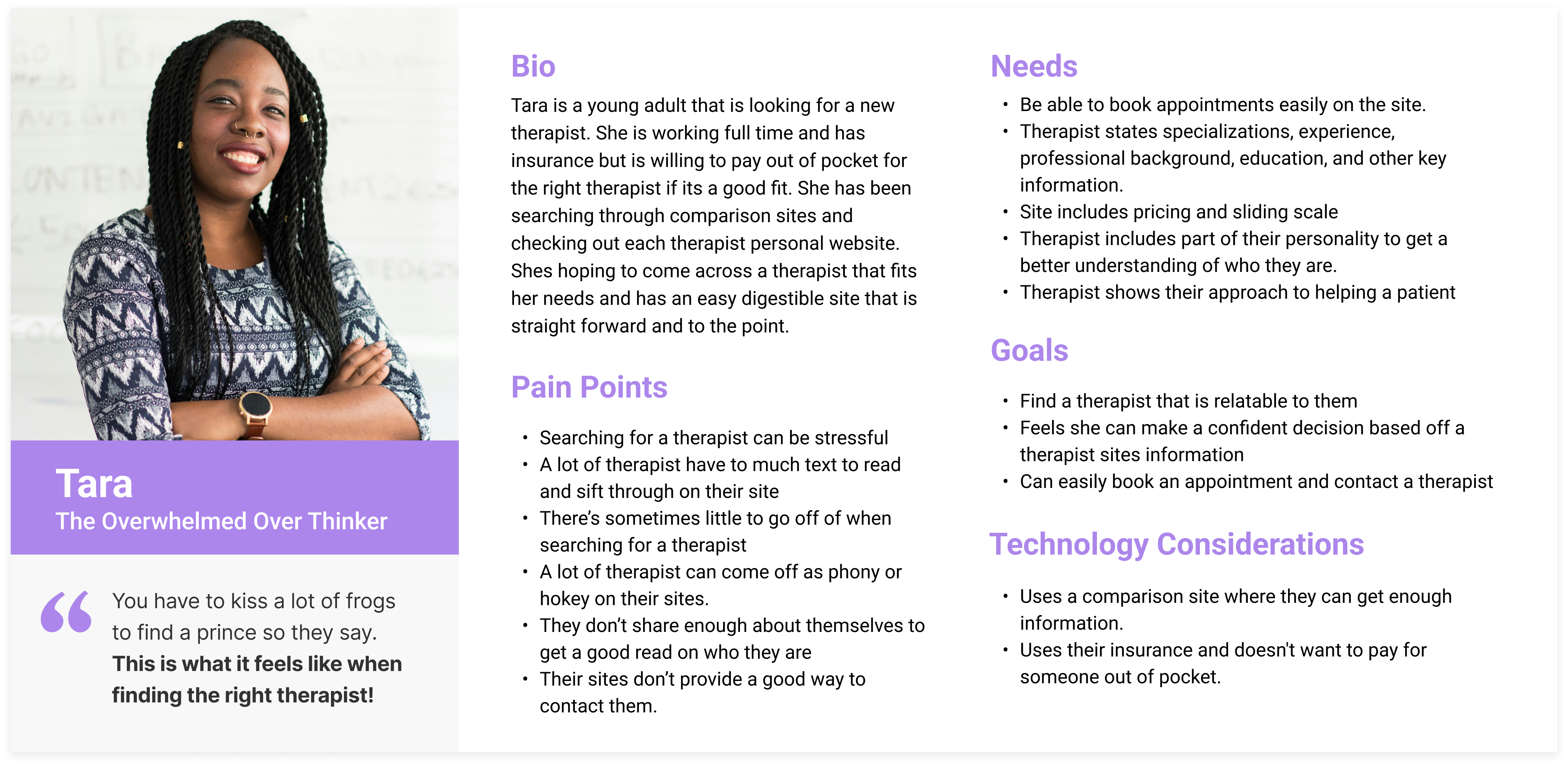
After all of the research conducted I used an empathy map to figure out the right persona. This helped me take what I learned and put it into a graph.
Persona
After creating my empathy map above i was able to create Tara ‘The Overwhelmed Over Thinker’. She was a combination of the users I interviewed.
After creating my persona and collecting data I create POV statements and HMW questions to help guide the direction of the project.
The Solution
The solution was to create a site that is easy to follow and fits with the what the client wanted. Features would include: About the therapist, treatment, specialities, contact info, and how to book and appointment.
Ideate
Information Architecture
Site Map
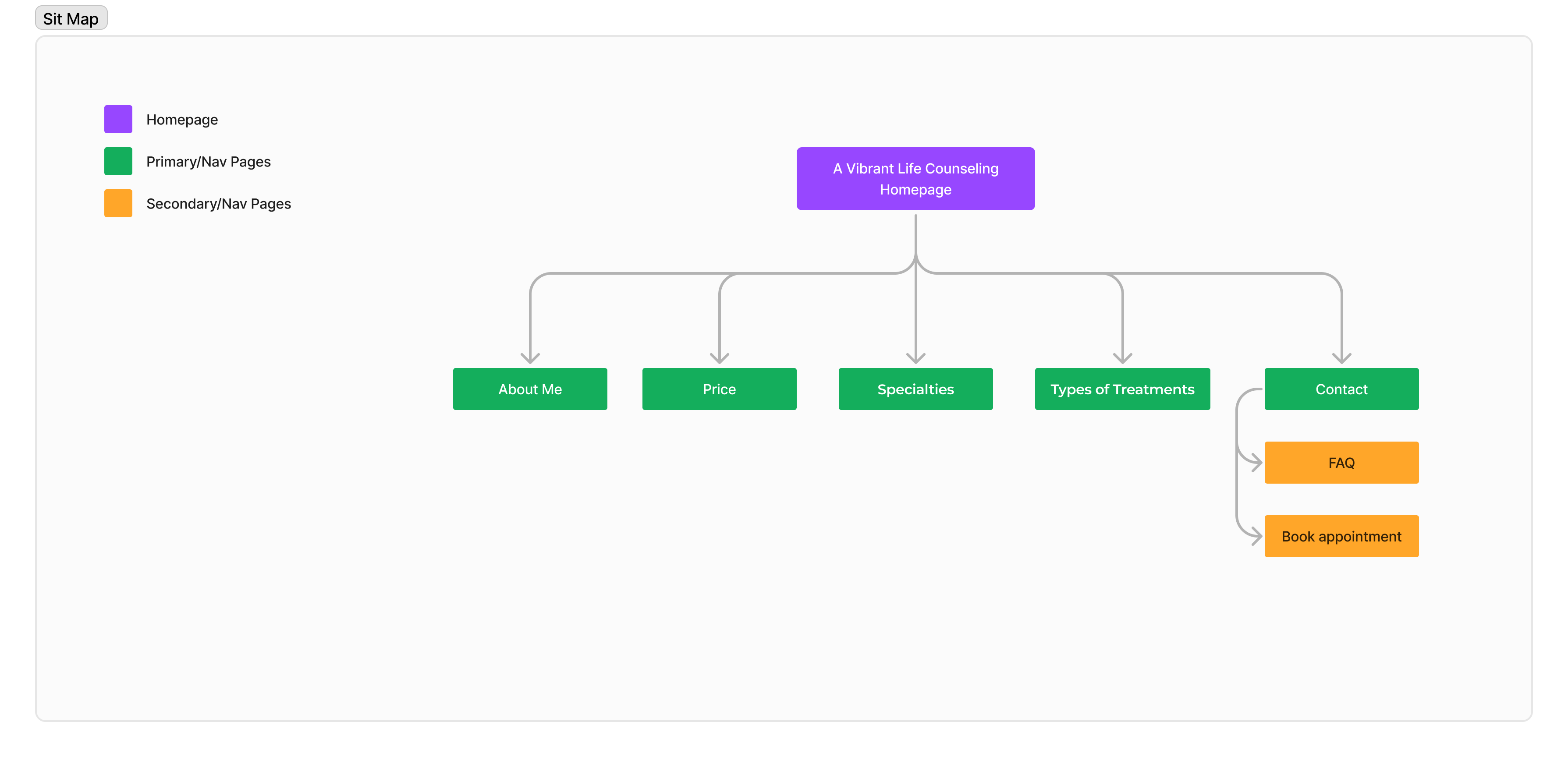
From user interviews, talking with the client, and research I was able to figure out the site structure. I wanted to keep it simple and create a simple site map for the site.
User Flows
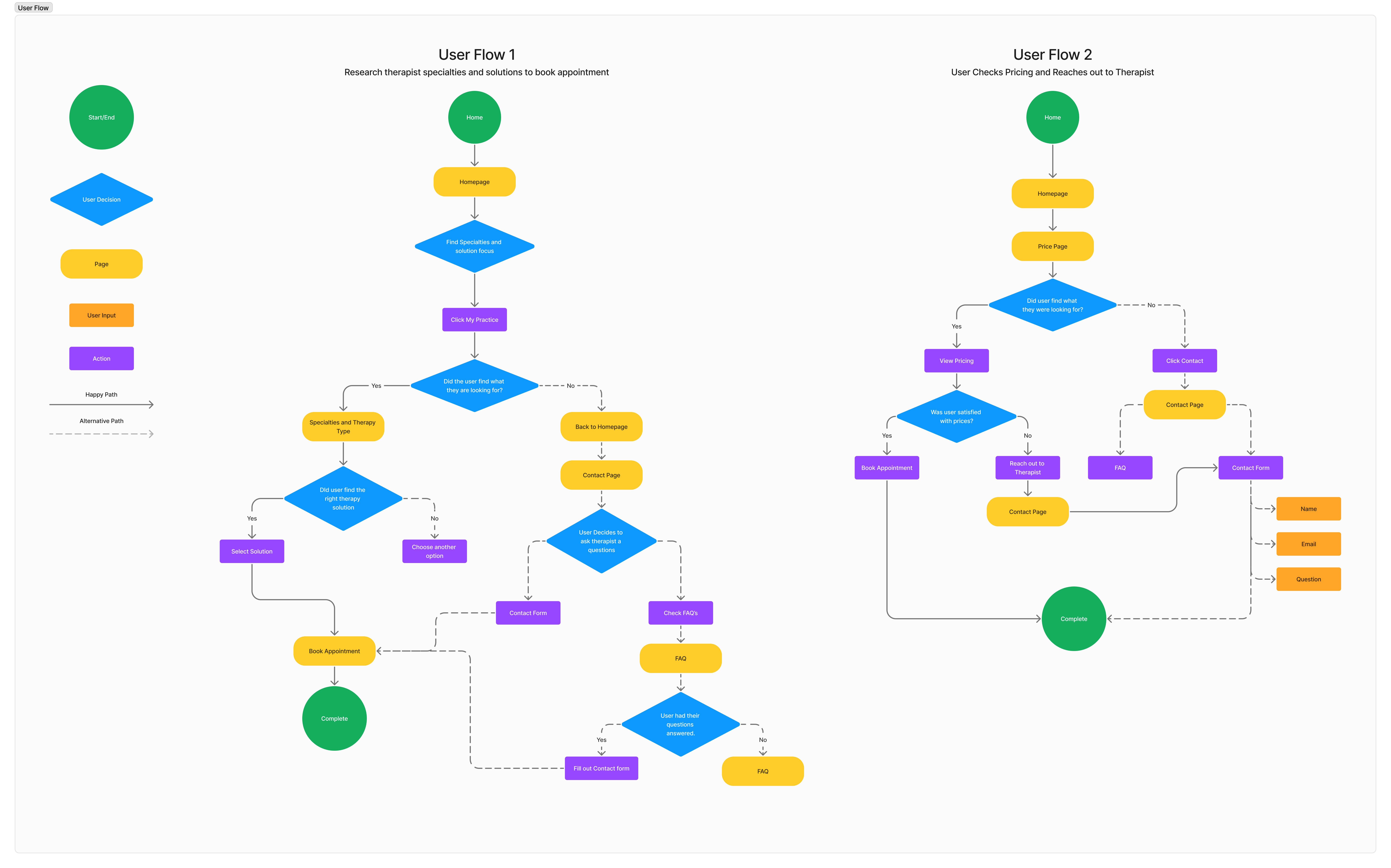
After creating a site map I was then able to start thinking of my user flow and how that would look. The first initial flows I created were researching therapist specialities, Booking an appointment, and checking therapist pricing.
Wireframes
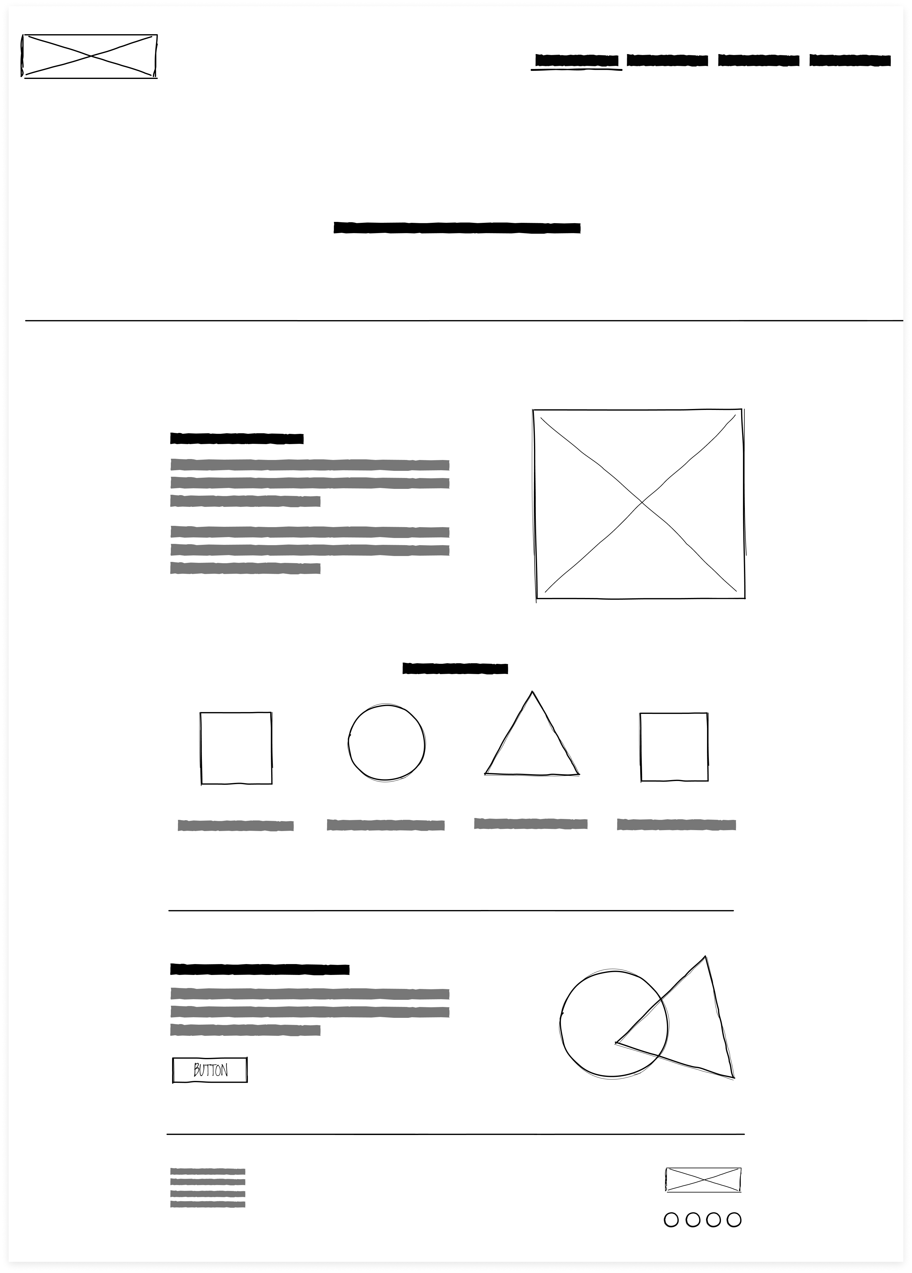
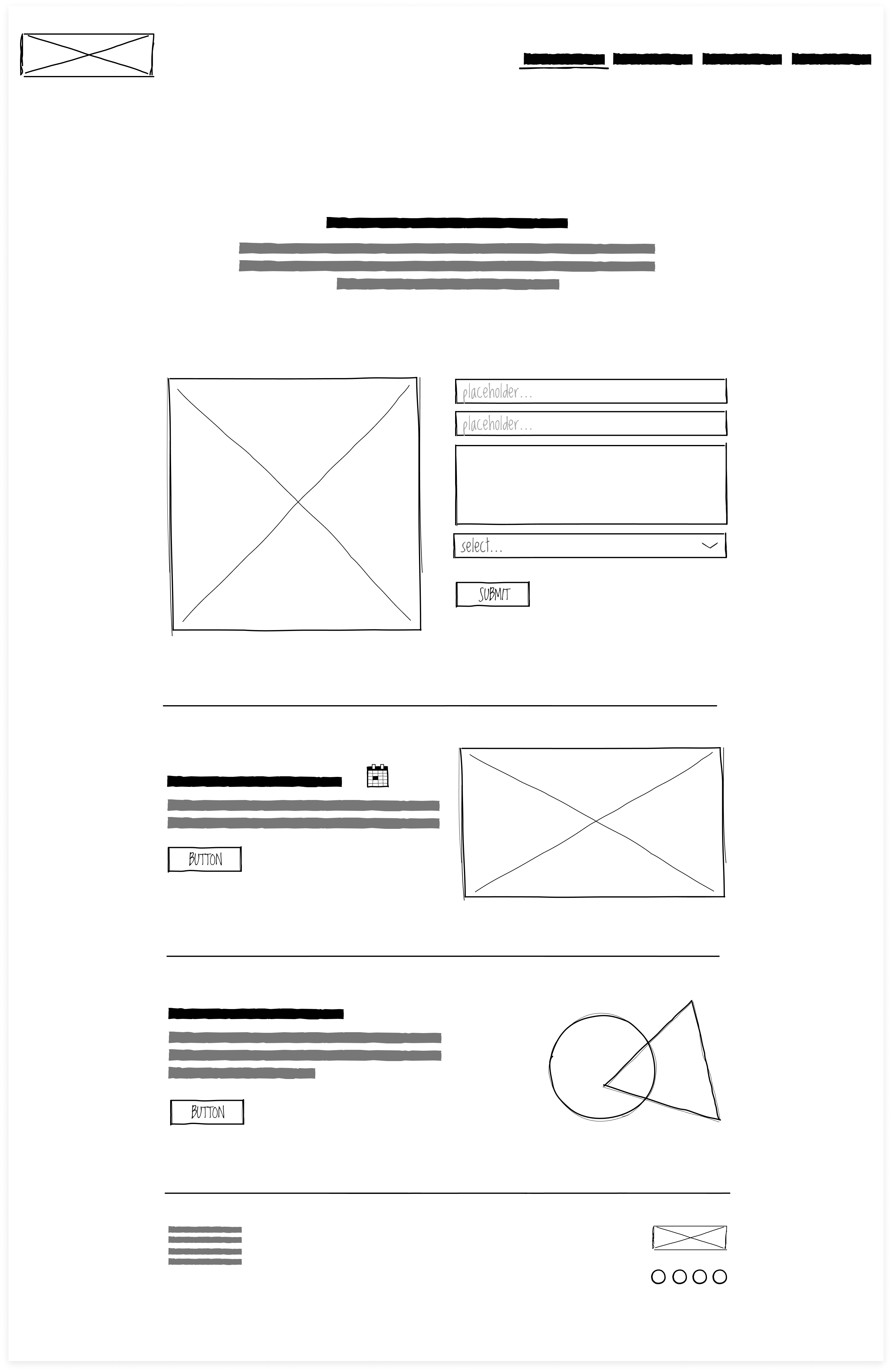
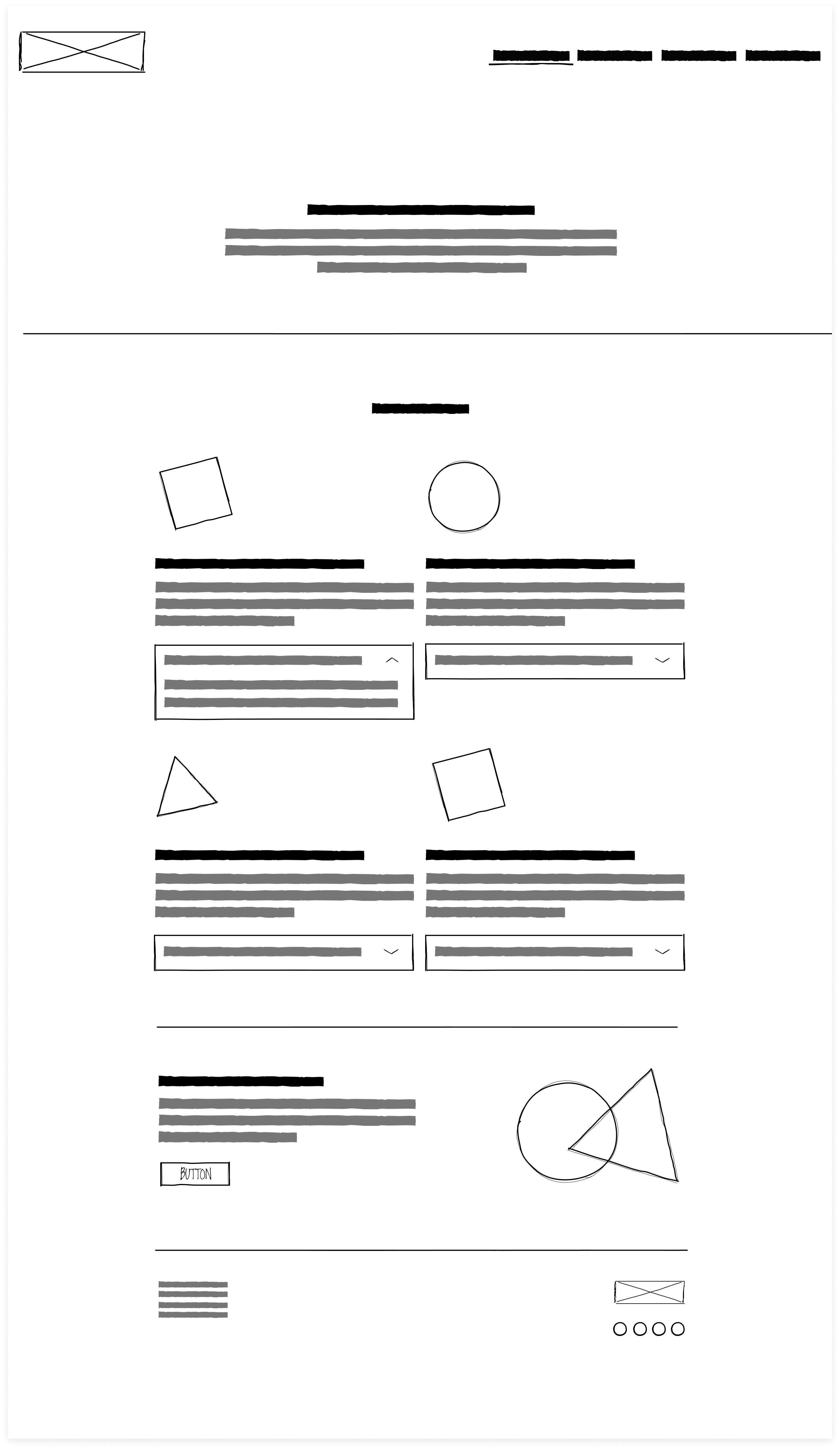
Low Fidelity Mobile & Desktop
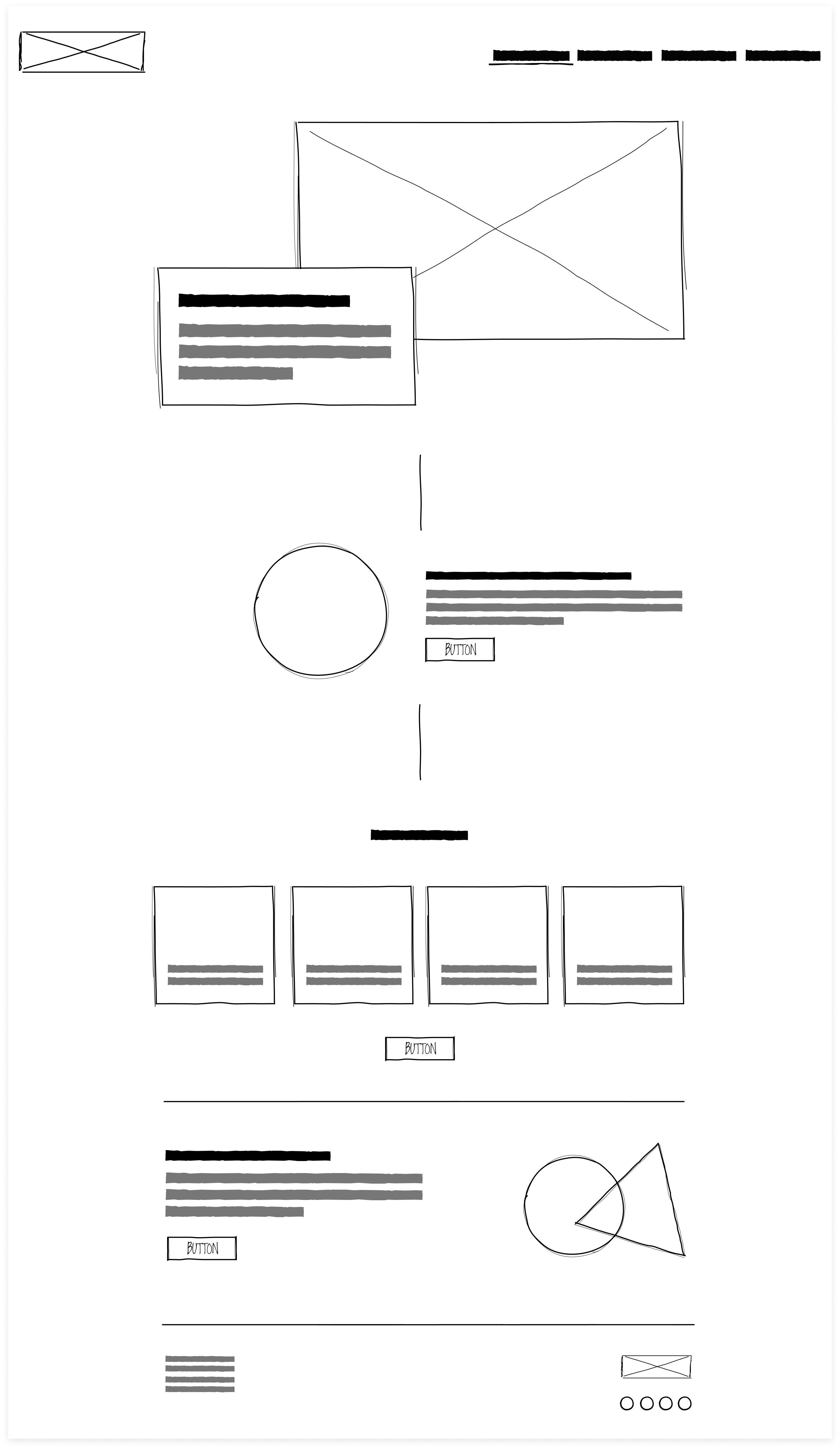
After going through the steps to create my site map, and user flows I was ready to begin early sketches. These show a couple of the screens I initially started out with based off of my flows. My pages to focus on our Homepage, About, Contact, and Skill & Expertise.
Homepage

About Me

Contact Me

Skills & Expertise

Homepage
About Me
Contact Me
Skills & Expertise
UI Design
Branding
My client was very specific about what she wanted her brand to be. We discussed colors, fonts, look and feel. The words to describe the brand is calming, mindful, vibrant, helpful, lively, and empathetic. I think we were able to achieve this.
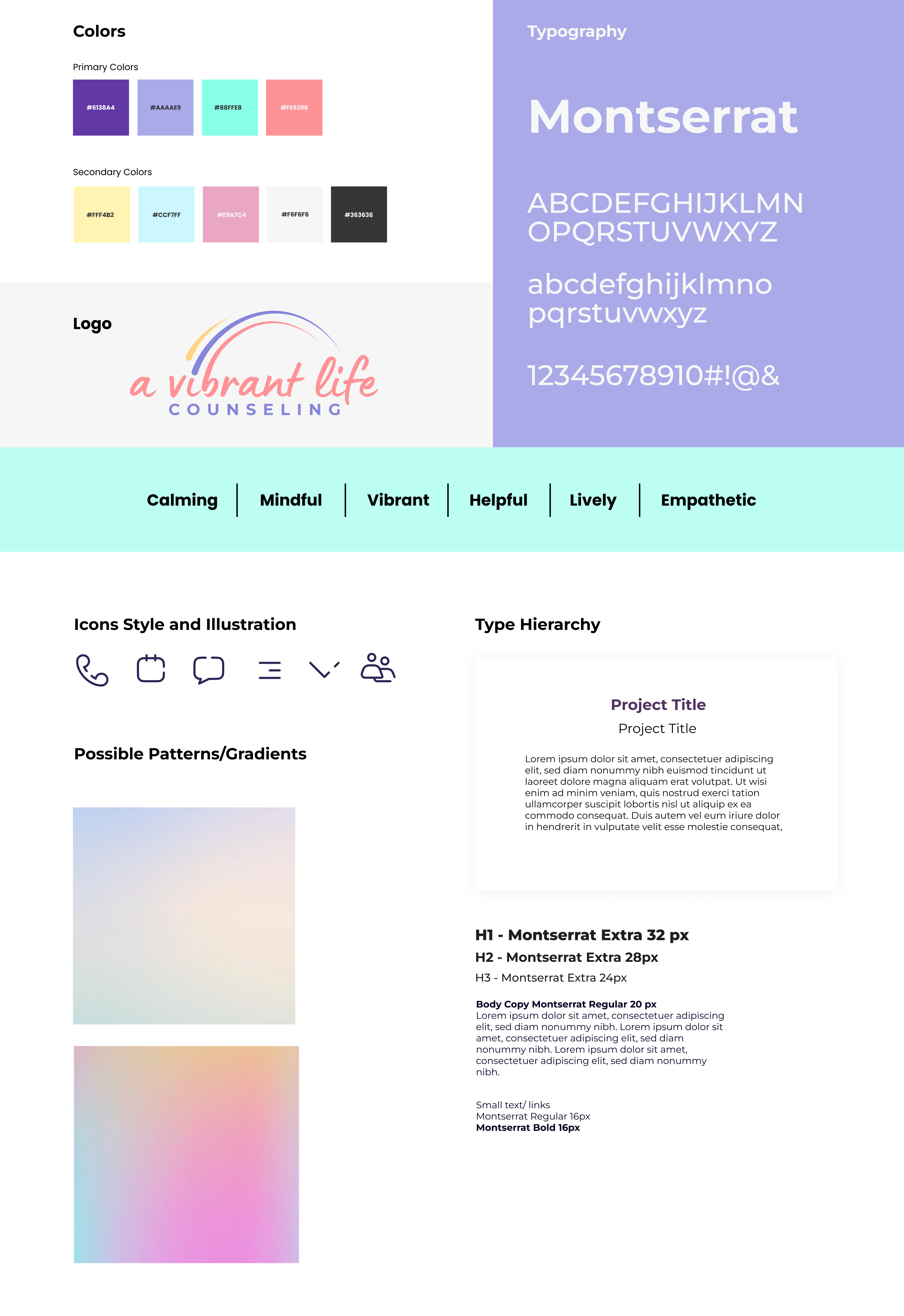
Branding Style Guide
As I created the brand for a vibrant life counseling I wanted to keep true to what my client wanted. She was specific on colors especially colors that popped. She also wanted to have gradients on the site to bring in that vibrant and calming effect.
I also chose the typeface Montserrat for the brand because it was simplistic and clean of the typeface.
High Fidelity Mobile Screens
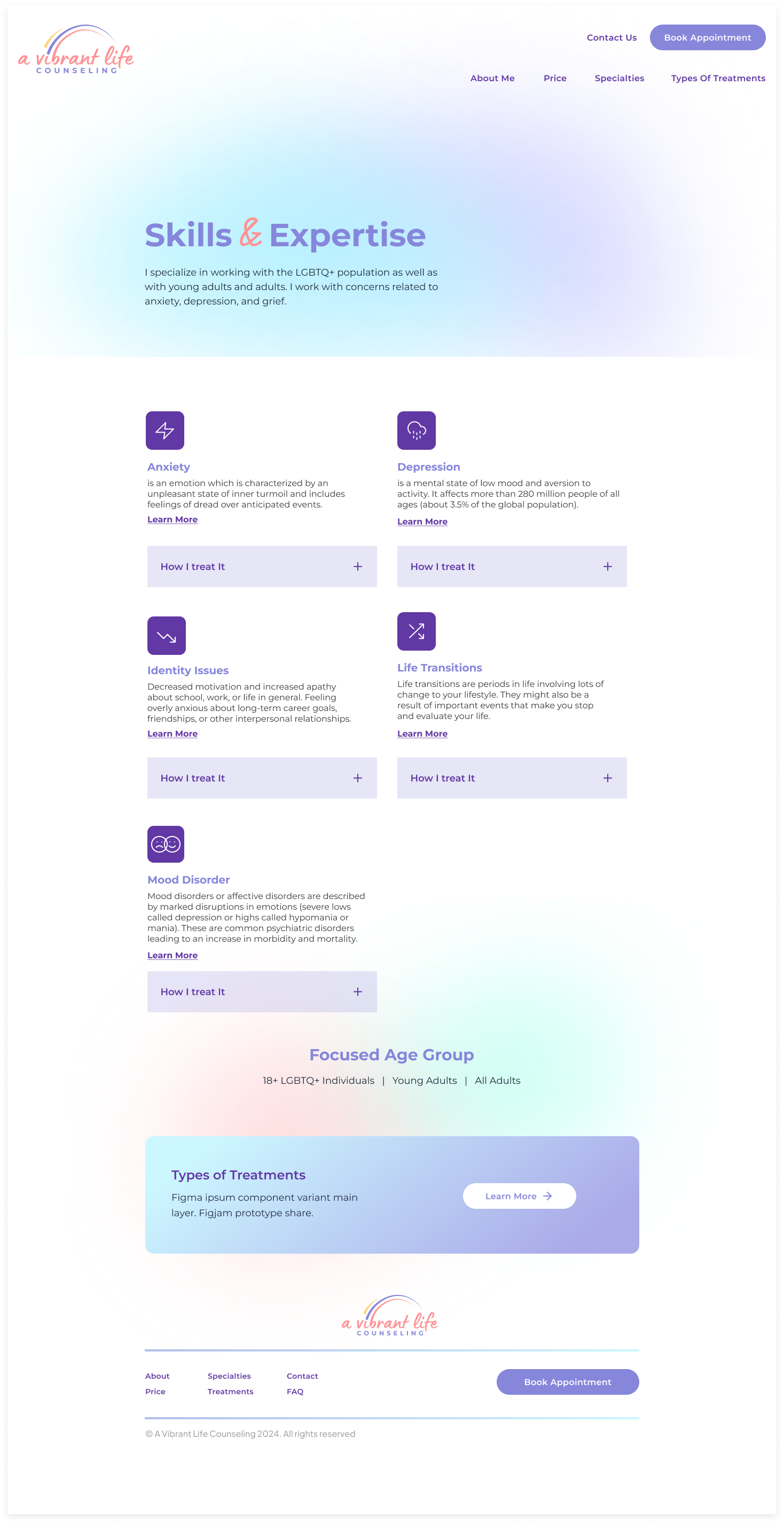
After developing the mid-fidelity sketches, I translated them into the final design. My client had specific preferences for colors and gradients, envisioning a vibrant yet calm aesthetic. To achieve this, I used gradients in the background and selected purple as the primary color for text.
Homepage

Book Appointment

Contact

Skills & Expertise

High Fidelity Desktop Screens
Homepage
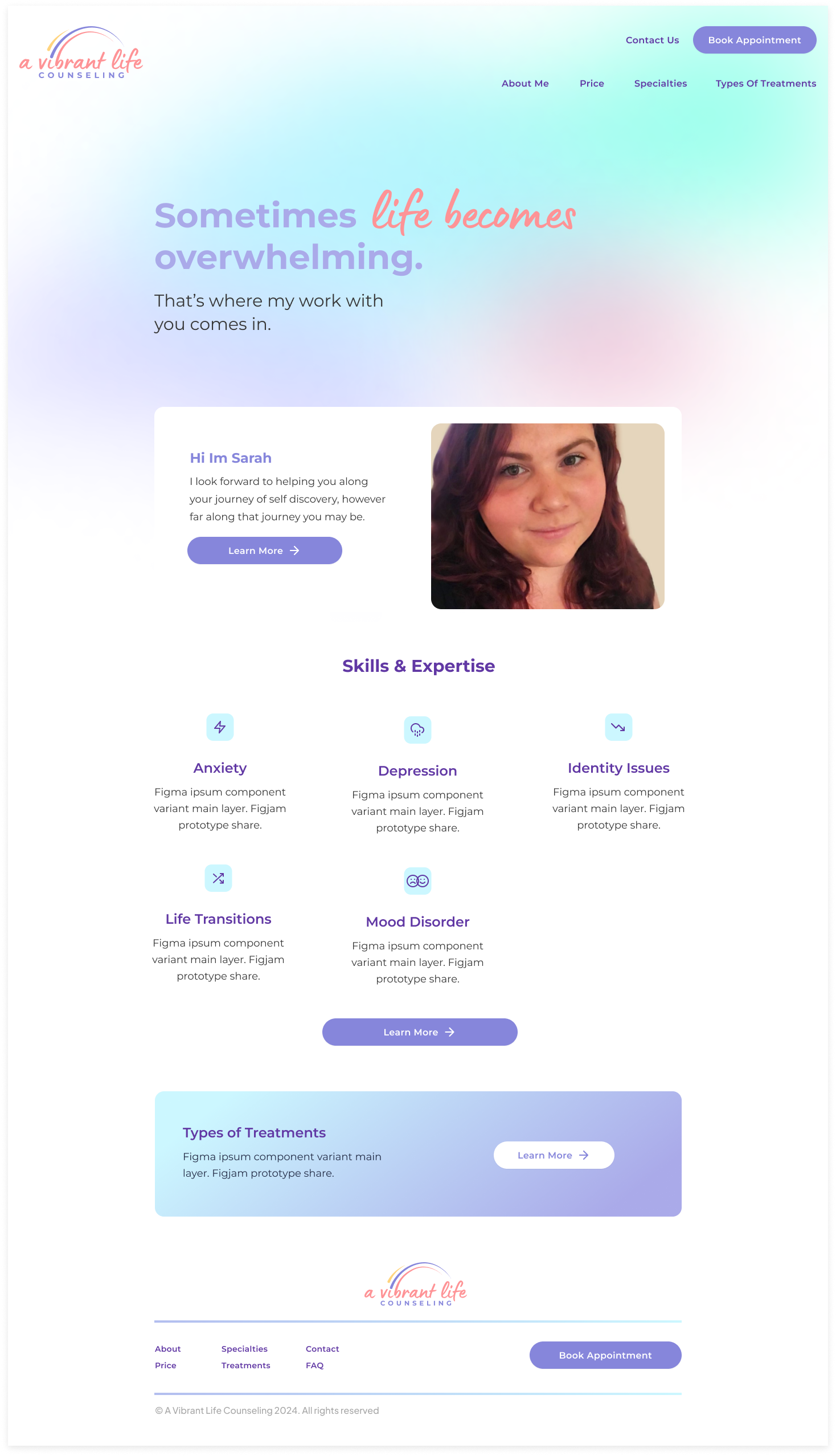
Book Appointment
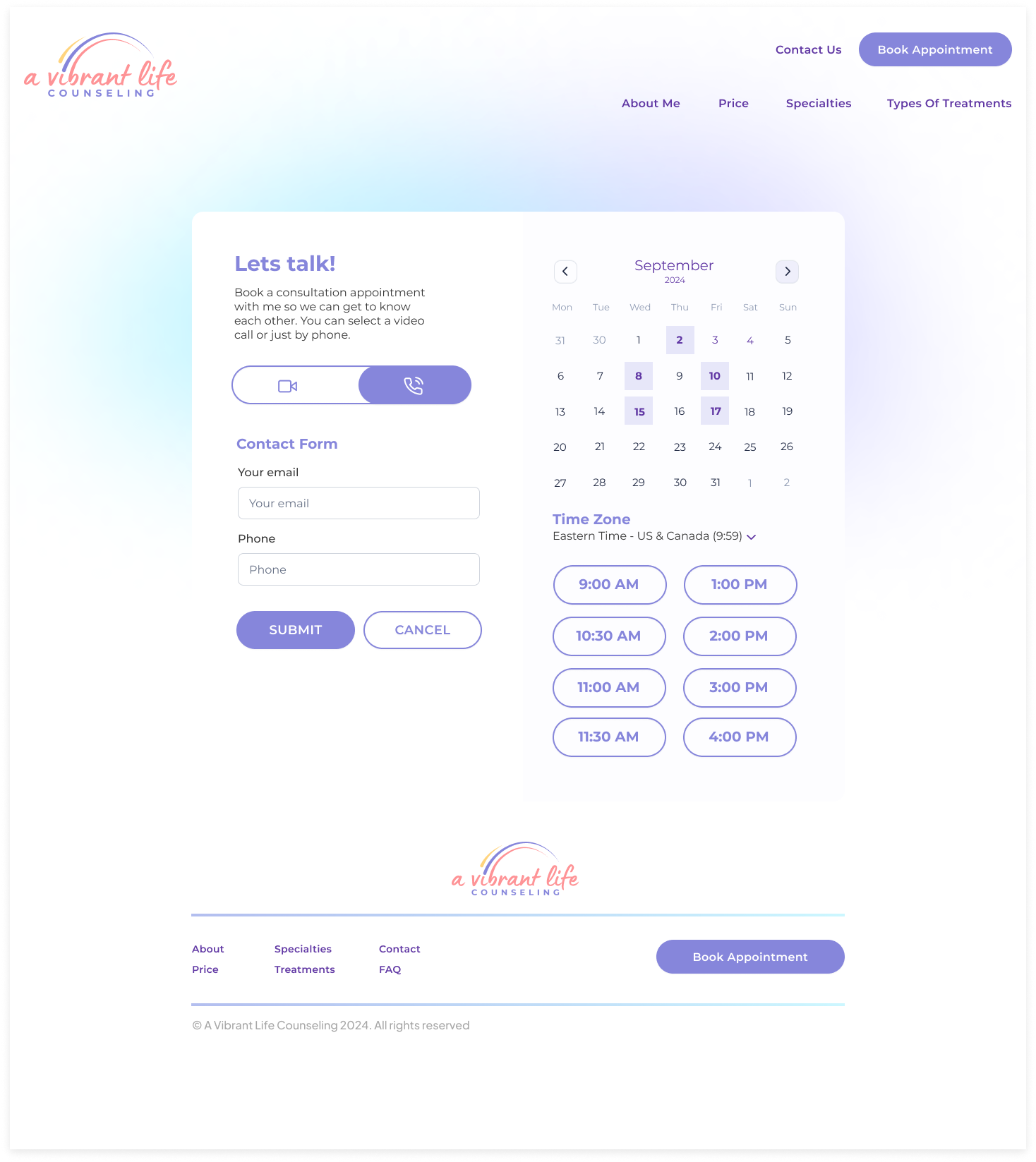
Contact
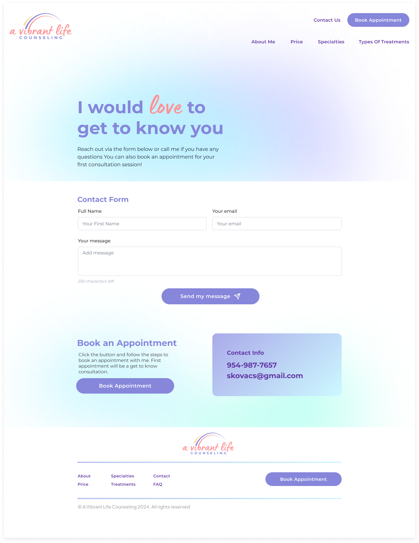
Skills & Expertise
Prototype & Test
Usability Test
I received some great feedback after running some usability test. I decided to work with the platform Maze for this project to conduct unmoderated testing. It was great to get some insight on where users clicked with heat maps and collecting survey answers.
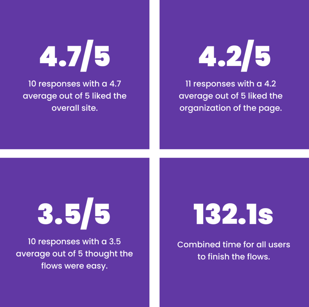
- Participants: 11
- Main issue mentioned: I would prefer to see an appointment option on the Main home screen.
- Main issue mentioned: I think even less information and copy would help.
- Main issue mentioned: A more intuitive flow to book appointments
Final Design
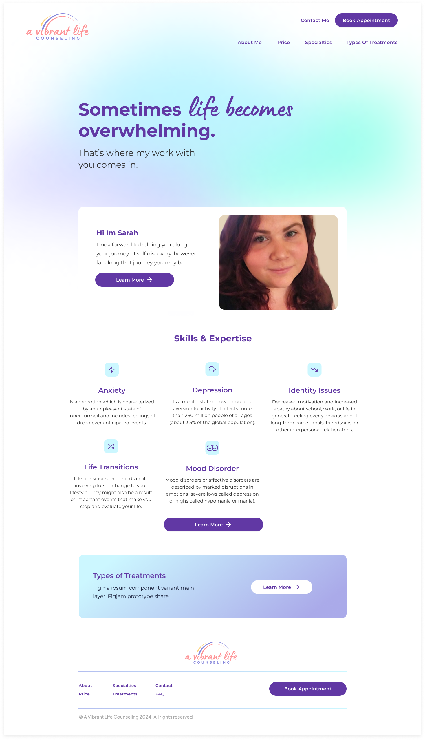
After reviewing all the feedback, I addressed the primary issues users encountered, particularly difficulties with booking appointments. To improve this, I streamlined the process by adding “Book a Demo” CTAs on the homepage. Additionally, I resolved other issues by removing certain colors and simplifying the content.
Original Homepage
The main feedback from users was that they had difficulty finding the “Book an Appointment” button and preferred it to be more prominent.

Revision
I relocated the “Book a Demo” button to the top of the homepage and darkened the purple color to improve readability.

Original Book an Appointment
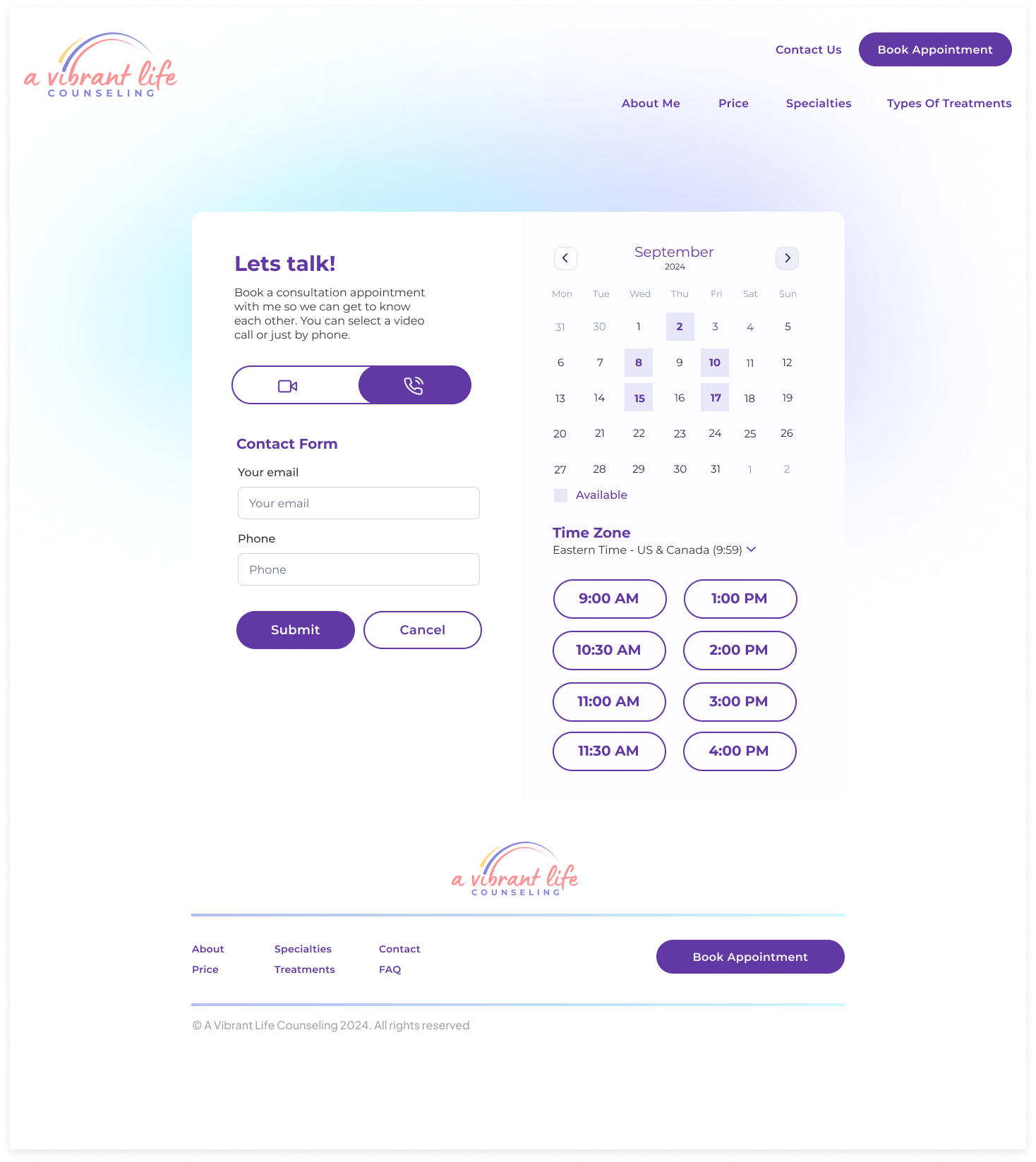
On the “Book a Demo” page, I initially used a lighter purple, but some users experienced clarity issues with this color choice.

Revision
I updated the colors and added more context to the page. I also included a legend for clarity and refined the form.

Homepage
Book an Appointment
Contact

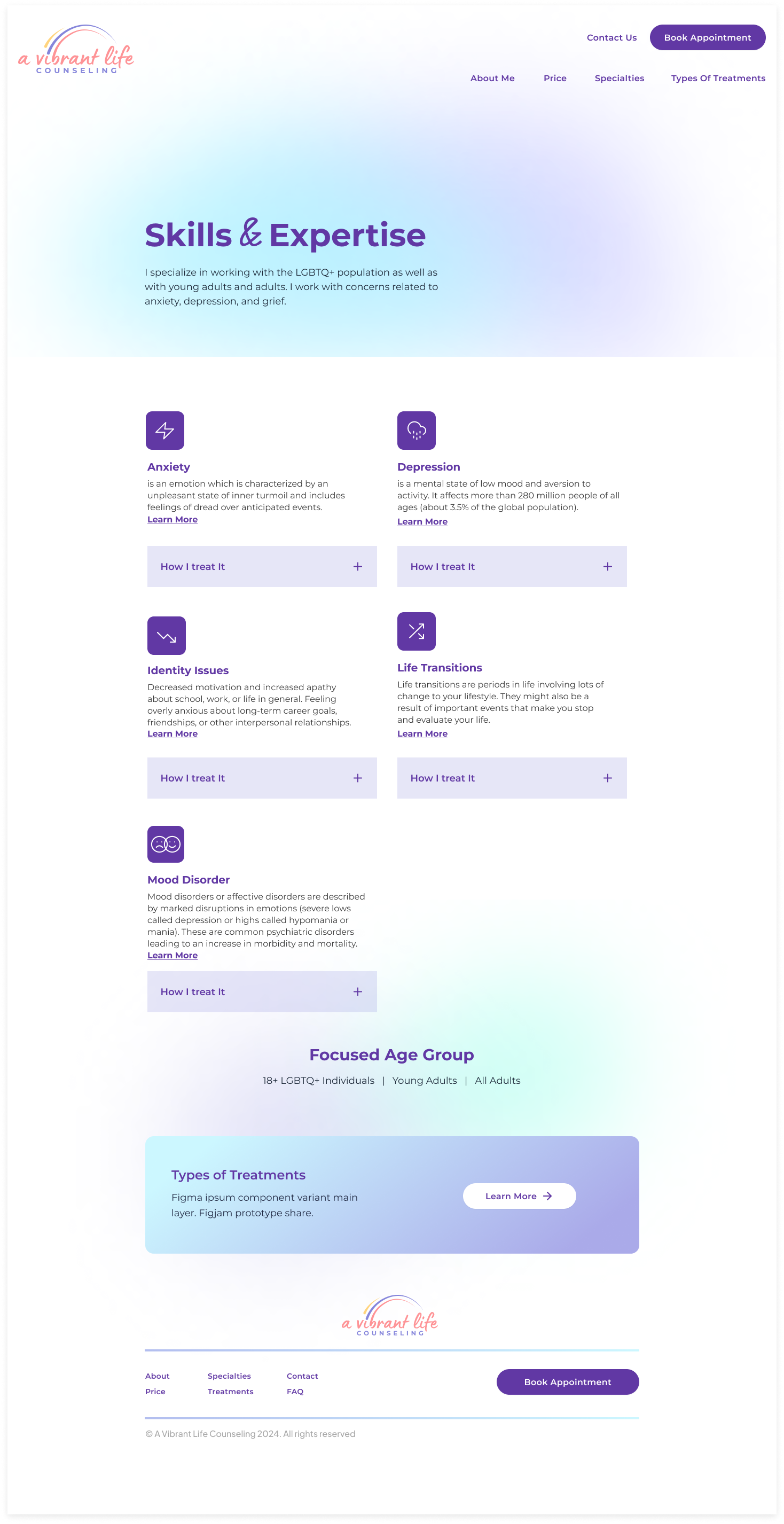
Skills & Expertise
Reflection
This project greatly contributed to my growth as a UX designer by allowing me to work with a real client—my friend who was starting her own private practice. I enjoyed collaborating closely with her to determine her preferences for fonts, colors, and overall design, and gaining practical experience from creating a usable site. The main challenges I faced included finding and scheduling time with participants, which often consumes much of my time on UX projects. Although the research phase didn’t reveal many surprises, it was insightful to learn how diverse individuals approach finding a therapist.
To ensure my design aligned with user needs, I carefully considered feedback from interviews, identified common themes during affinity mapping, and focused on the most critical needs within the project’s scope. I had to make trade-offs by prioritizing the most essential features due to time constraints, though I had many additional ideas. Key takeaways from this experience include the importance of understanding both the client’s needs and the users’ needs, and the challenge of finding suitable users for research, especially when some may not use therapy services or platforms.
