Concept: Music Sharing with Friends
My Role
Research, User flows, Wireframes, User Interface, Usability Testing, Prototype
Client
UX Academy Add a Feature Capstone Project
Timeline
75 hours
Background
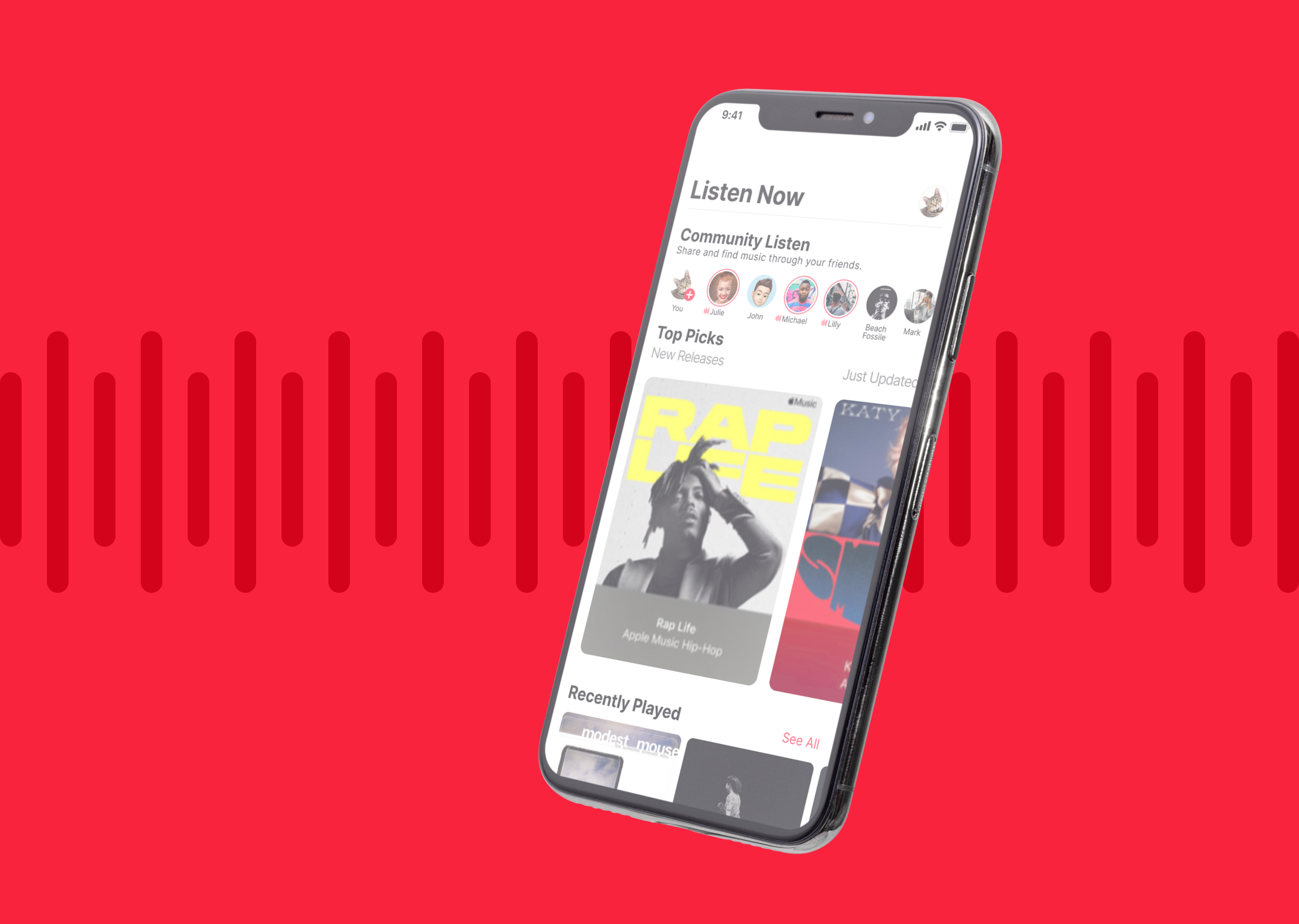
Apple Music is one of the leading music streaming apps, competing with Spotify. Currently, Apple Music offers fewer social features compared to Spotify. To enhance its competitive edge, a new feature has been introduced that allows users to share their favorite songs within the app for 24 hours and view the songs their friends share. This fictional concept feature not only facilitates connections with others but also helps users discover new music in a more personalized way.
Empathize
What Were the Research Goals?
I want to understand whether Spotify’s social features add value for users. Specifically, I’m interested in whether these social aspects help users discover more music, connect with others, and enhance their overall music experience. While both Spotify and Apple Music offer a simple interface, Spotify currently outperforms Apple Music with its social features. I’m exploring how significantly these social aspects impact the user experience and how we might incorporate them into Apple Music in a unique way to attract more users.
High Level Goals and Objectives
- Gain More Users
- Discover new music in a more personal way
- User can share their personality through music
- Create a new experience from the competitors
- Expand on social in a non intrusive way
Secondary and Primary Research
Secondary Research
Competitive Analysis
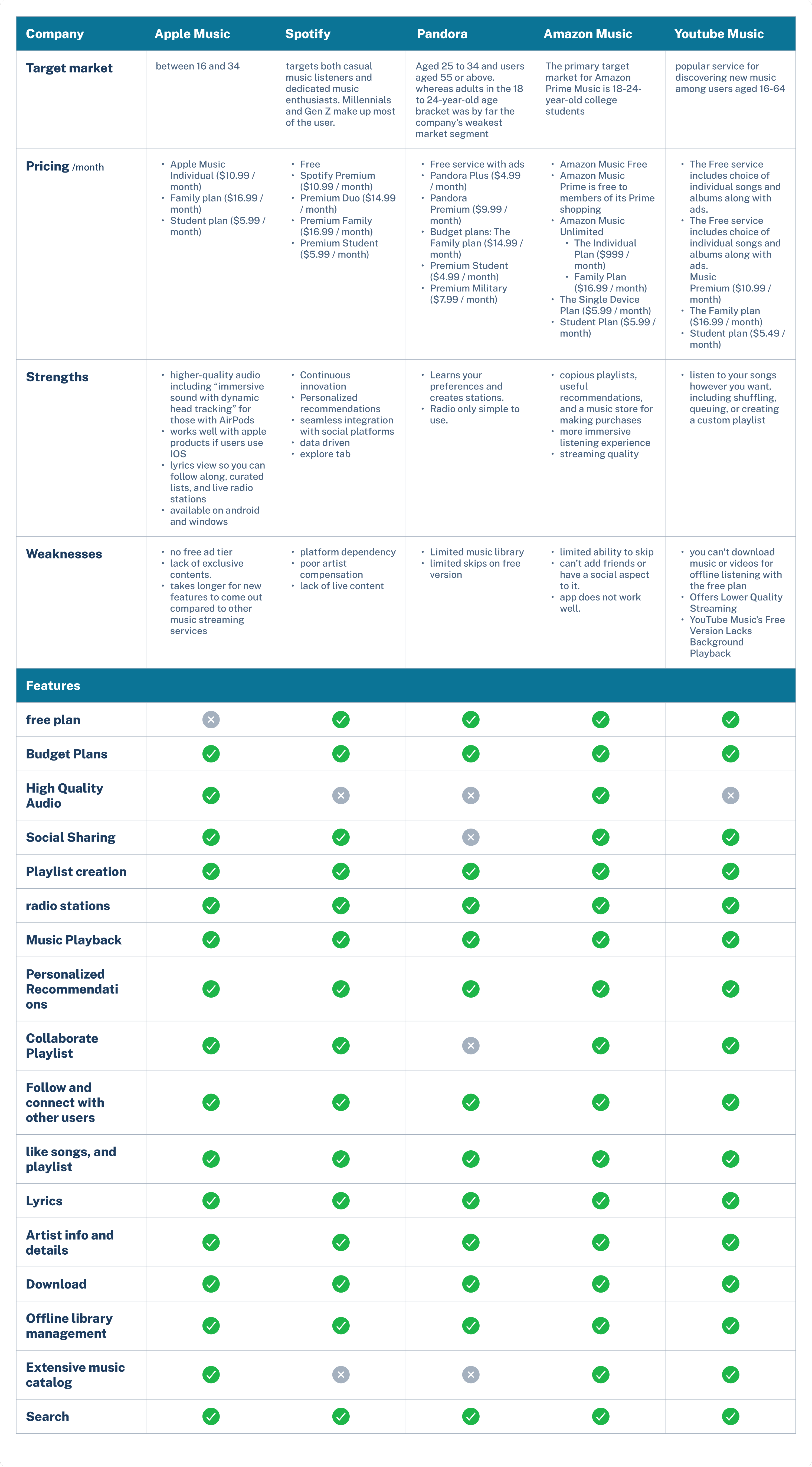
I did some initial research looking Apple Musics biggest competitors. I was able to create this comparison analysis to figure out what each platform shares in common and what makes each one stand out. From this I was able to figure out what feature could work for Apple Music.
Primary Research
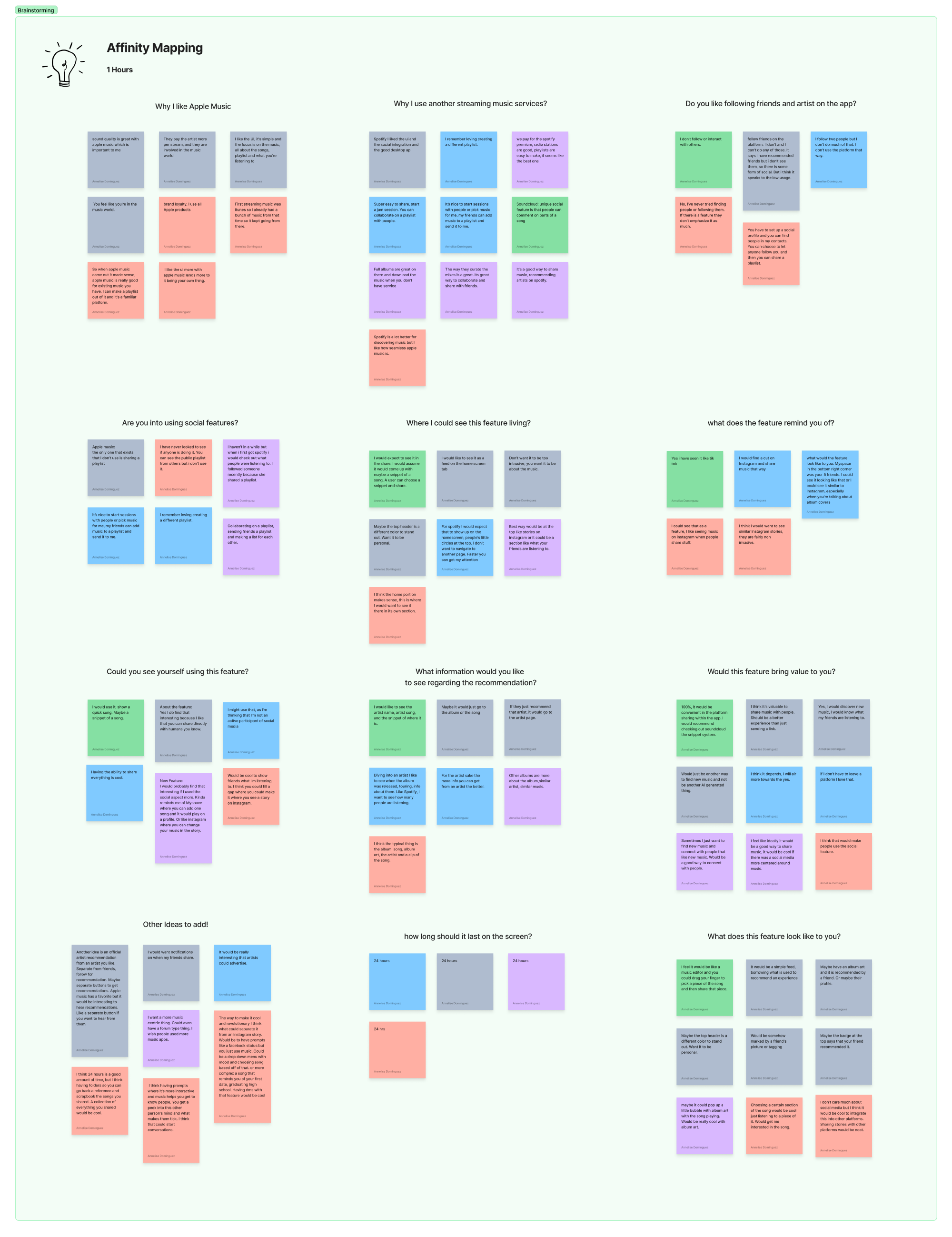
I was able to interview 5 adults to get a better understanding of their thoughts on the social feature. After the interviews I created an Affinity Map and created groupings of the findings.
- Where would you want to see this feature live.
- Could you see yourself using this feature.
- Have you seen a feature like this before.
- What does this feature look like to you.
Define
The Problems
Apple Music is lacking in a social experience compared to its competitor Spotify. At the moment Spotify dominates in this part of its music app. I would like to see how a social aspect could be incorporated more into the app.
Persona
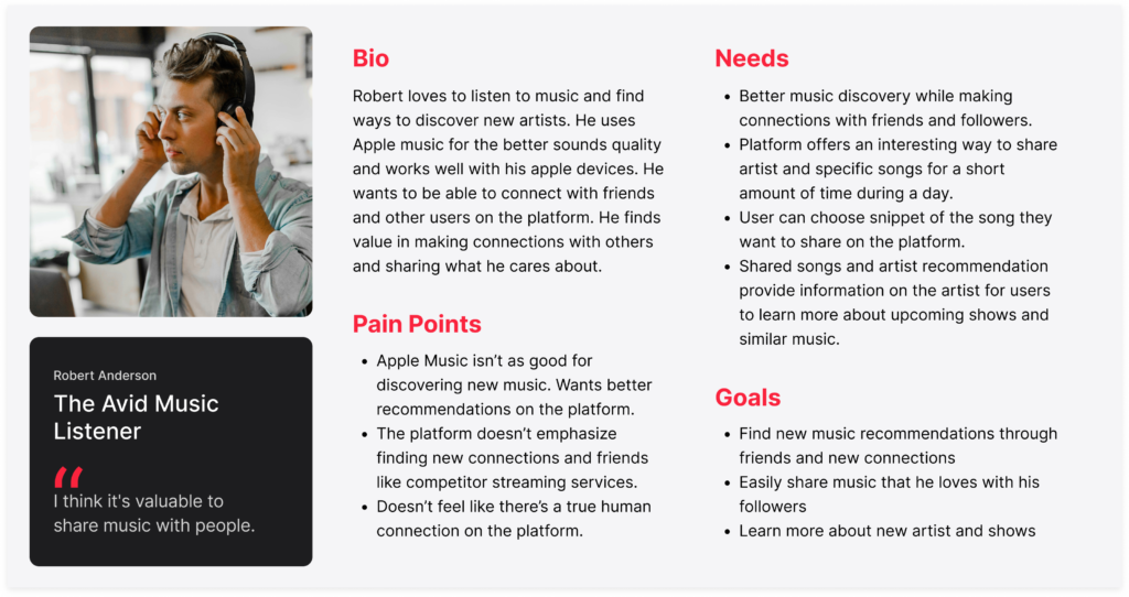
After all the research I created the persona of Robert ‘The Avid Music Listener’. He loves to find new music and would love to connect with others in the app. I was then able to create POV statements and HMW questions to help guide the direction of the project.
The Solution
The solution is to create a feature that a user would use and help them connect within the app. This feature would give the user the ability to share their interest and discover new music through their personal connections. The feature needs to be simple and familiar so the user knows how to use it.
Ideate
Information Architecture
User Flows
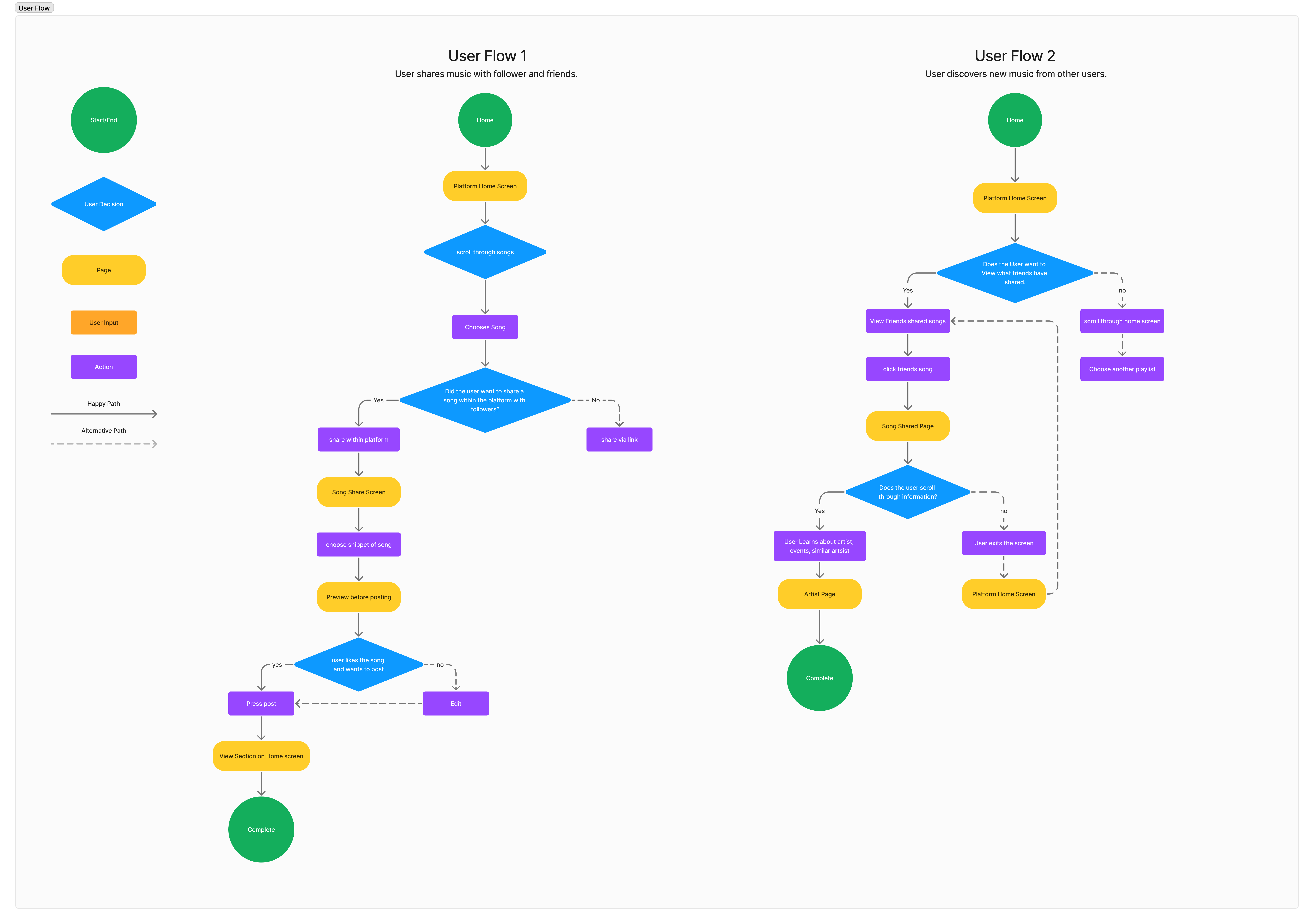
After creating a site map I was then able to start thinking of my user flow and how that would look. The first initial flows I created were how a user shares music with follower and how a user discovers new music from others.
Wireframes
Low Fidelity
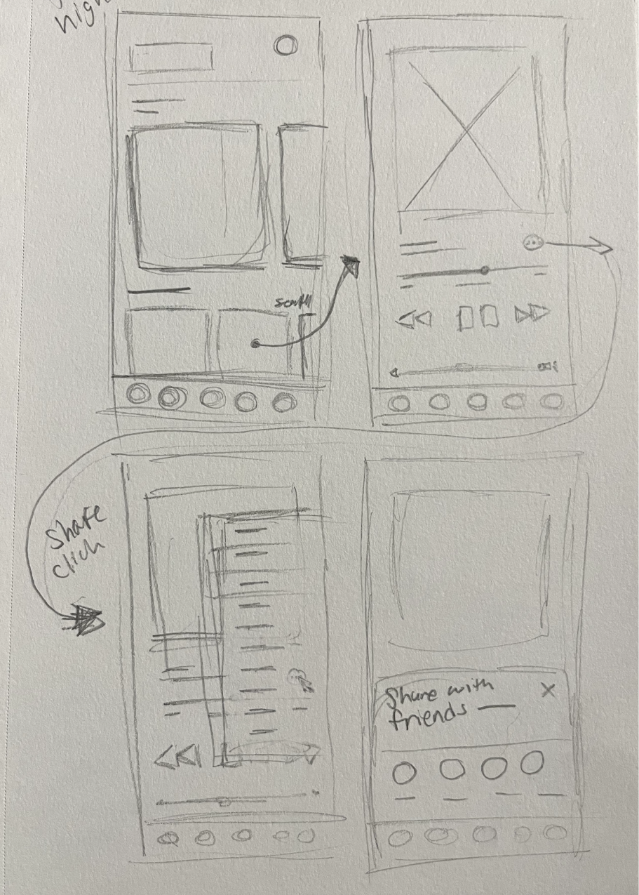
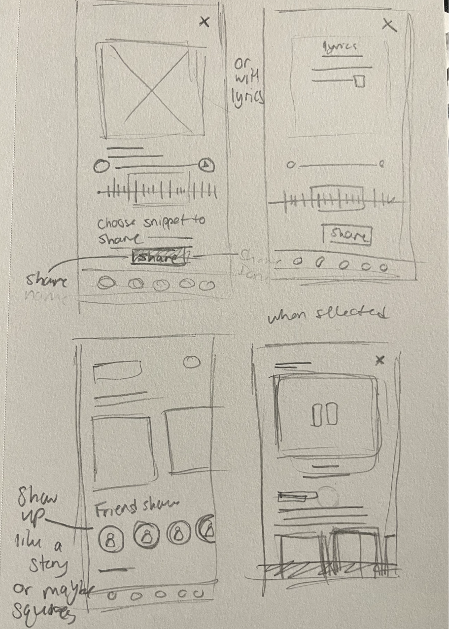
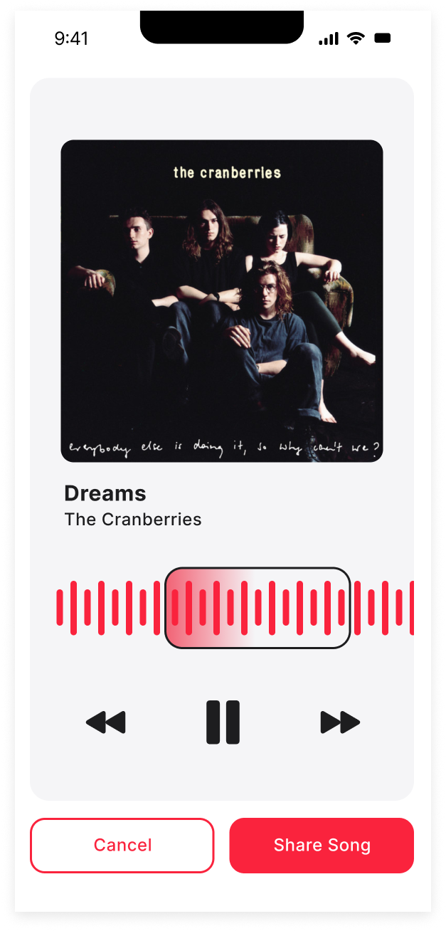
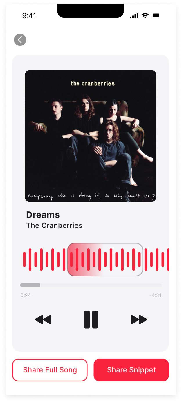
After going through the steps to create the user flows I was ready to begin early sketches. These show a couple of the screens I initially started out with based off of my flows. I focused on the homepage, how a user shares a song, users selecting snippet, and the song page.
“>Homepage/Share song
“>Select Snippet/Song Page
High Fidelity
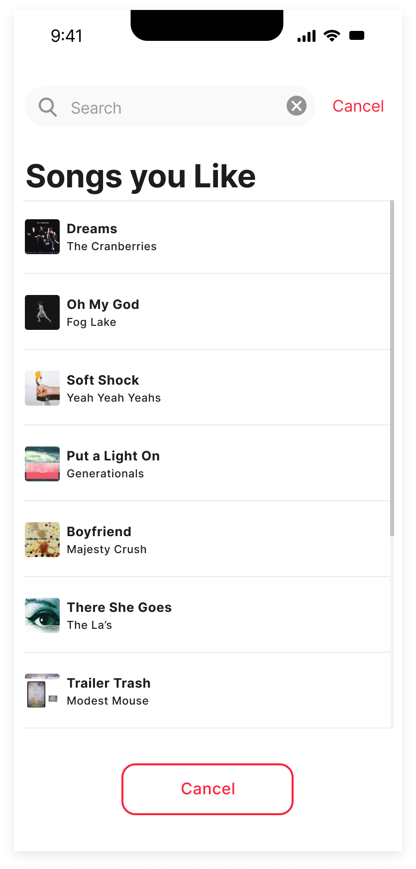
A major challenge was maintaining consistency with the brand and Apple’s design system. I strived to match the current app’s look as closely as possible. Fortunately, the Figma community proved invaluable in providing design systems that guided my efforts.
Homepage

Find Song
Song Snippet
Shared Song on Homepage

Share From Song
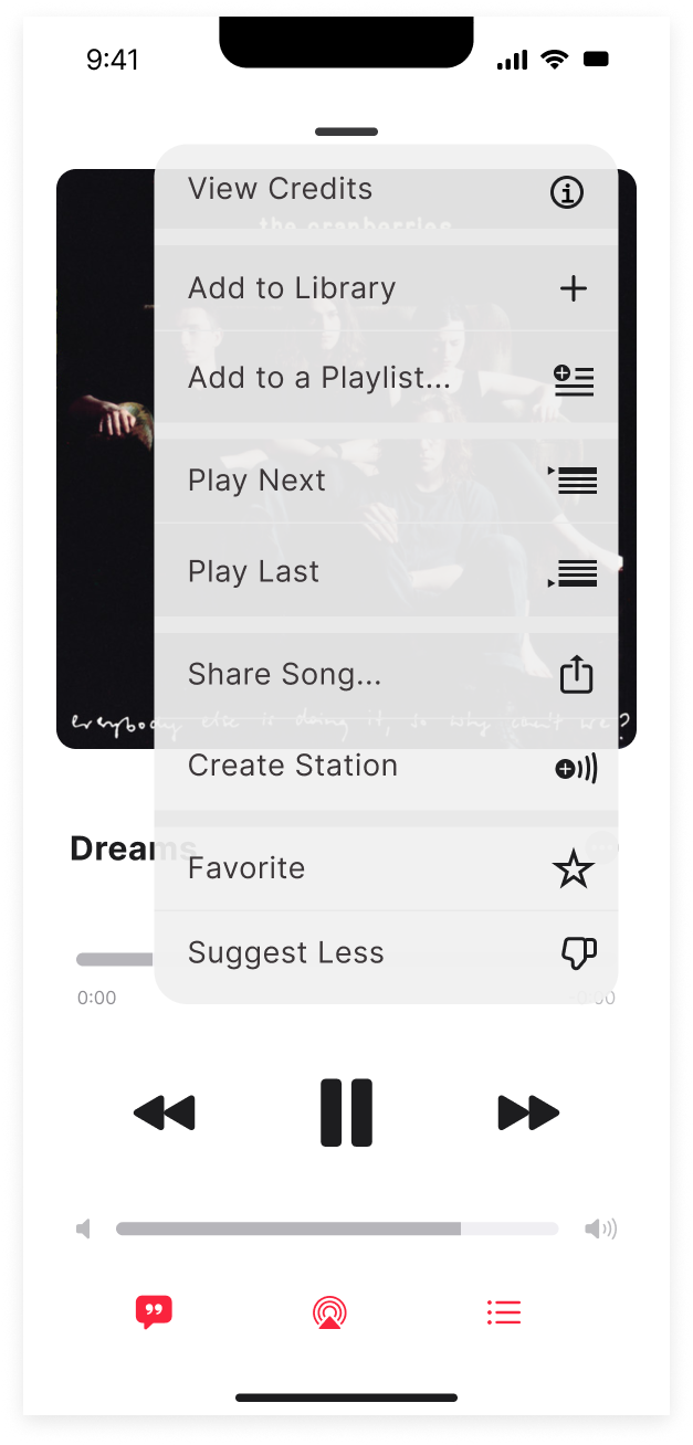
Share Menu
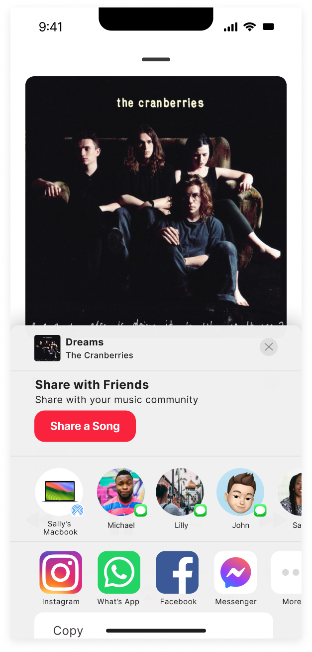
Shared Song

Prototype & Test
Usability Test
I received some great feedback after running some usability test. I conducted moderated usability testing both over video call and in person. I took them through two task one being how a user shares a song and how a user views a song that a friend shared.
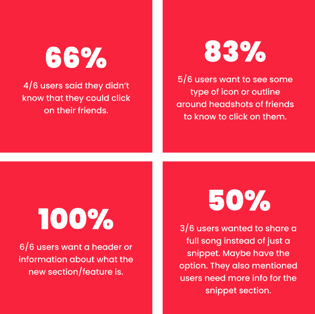
- Participants: 6
- 3/6 users went through the task successfully without issue.
- The average ease of use rating was 4.0 on a scale of 1-5, where 5 was very easy.
- Took users about 10 mins to complete both task.
Final Design
After reviewing all the feedback, I addressed the primary issues users encountered. This included adding a title to the new social section for better context, clarifying when a friend has shared a song, and updating elements to better align with Apple Music’s existing design.
Original Homepage
The original design featured a large share button at the top of the homepage, but it lacked a header.

Revision
To address the issue, I replaced the share button with a plus sign similar to other social shares and a header

Original Song Snippet
The original snippets page lacked a timestamp, which Apple Music includes. Additionally, it initially featured both a cancel and a share button.

Revision
I added the timestamp and included a “Share Full Song” button, as requested by users during testing.
Original Shared Music
The original design featured a large plus sign for sharing more songs, with the user’s story appearing next to it.

Revision
Users mentioned that they were confused by this screen, so I updated it by adding a circle around profiles to indicate when a song was shared, along with a music icon for clarity.

Original Song Page
This was the original song page that users saw after checking out a song shared by a friend. From this page, users could view the song, share it, jump to the album, view lyrics, and more.

Revision
Some users mentioned that they didn’t want buttons exclusively for sharing to social media, so I changed the button to a more general ‘Share’ option.

Reflection
This project has significantly contributed to my growth as a UX designer by challenging me to work within an established brand and its design system, providing a realistic scenario for joining a company and working on its existing products. I particularly enjoyed working within the design system to create a feature that integrates seamlessly with the product and enhances user discovery through friends and followers. The main challenge I faced was the initial research phase, including setting up interviews and matching the UI design system to Apple Music’s look and feel. An unexpected finding was that users felt current music streaming services lacked meaningful interaction with friends and family, and they responded positively to the idea of a new feature addressing this gap.
To align my design solutions with user needs, I carefully considered feedback from interviews and usability testing. I had to make trade-offs, such as simplifying features to stay within time constraints, focusing on core functionality over additional interactive ideas. Key takeaways from this experience include the importance of concentrating on a single aspect and refining it to best serve users, rather than juggling multiple ideas at once.
