Fresh Pantry
My Role
Research, Information Architecture, User flows, Sketching, Wireframes, Branding, User Interface, Usability Testing, Prototype
Client
UX Academy End to End Project
Timeline
100 hours
Background
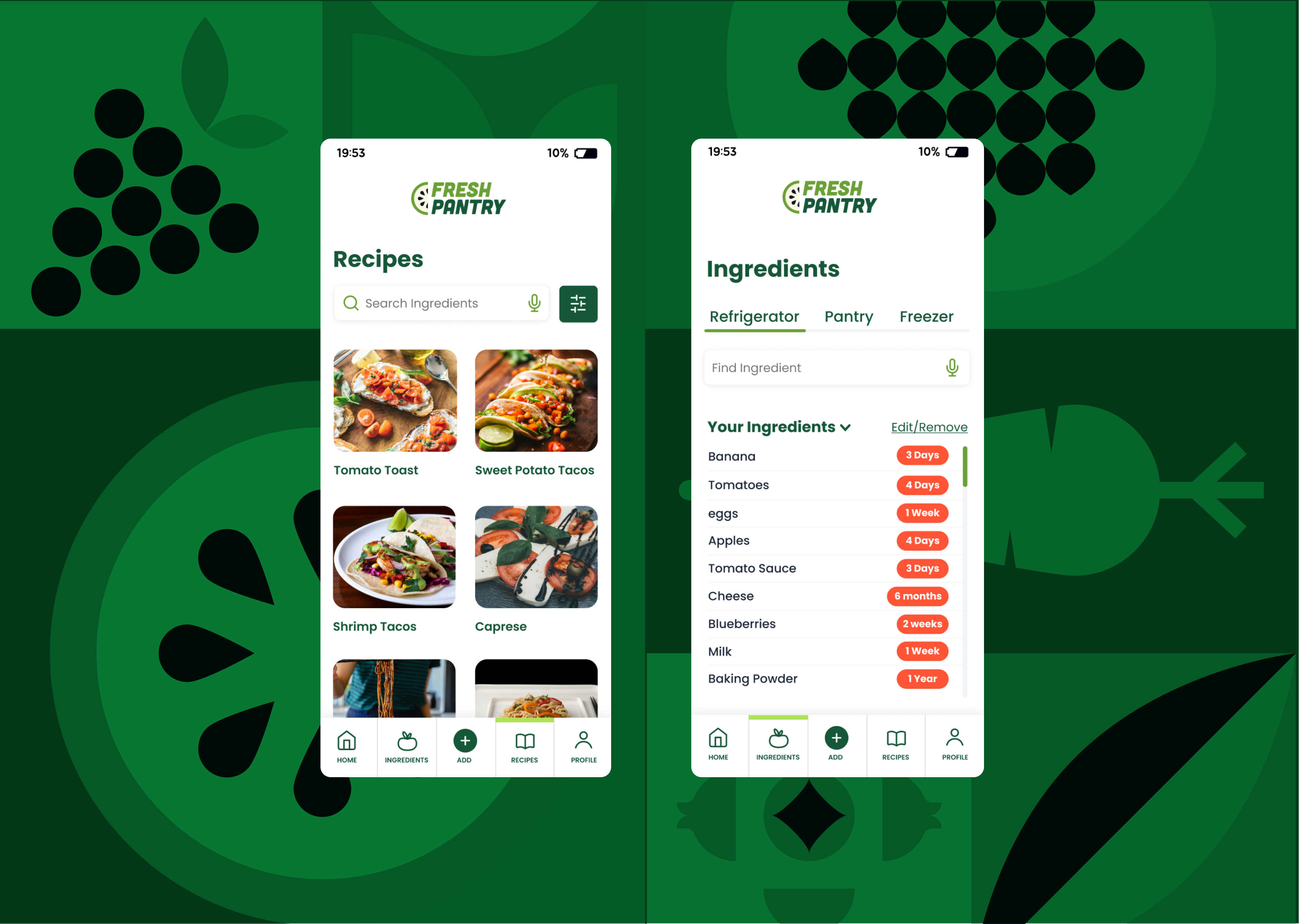
Fresh Pantry is designed to assist anyone who struggles in the kitchen. The app’s primary goal is to help users find recipes based on the ingredients they have and to keep track of those ingredients. Users mentioned in interviews that they have difficulty managing ingredients on a weekly basis. Fresh Pantry aims to address this issue by leveraging AI to help users search for and add ingredients, making their kitchen experience more manageable.
Empathize
What Were the Research Goals?
We aim to understand how a cooking app can assist users in utilizing all of their ingredients and discovering new recipes that they will enjoy.
- Understanding if a user finds cooking apps helpful and useful.
- Understanding how users cook and how they go about the process.
- Understanding how users shop for groceries.
- Understanding if recipes based on current ingredients is something they want.
- Understanding how a user learns to cook.
Secondary and Primary Research
Secondary Research
Competitive Analysis
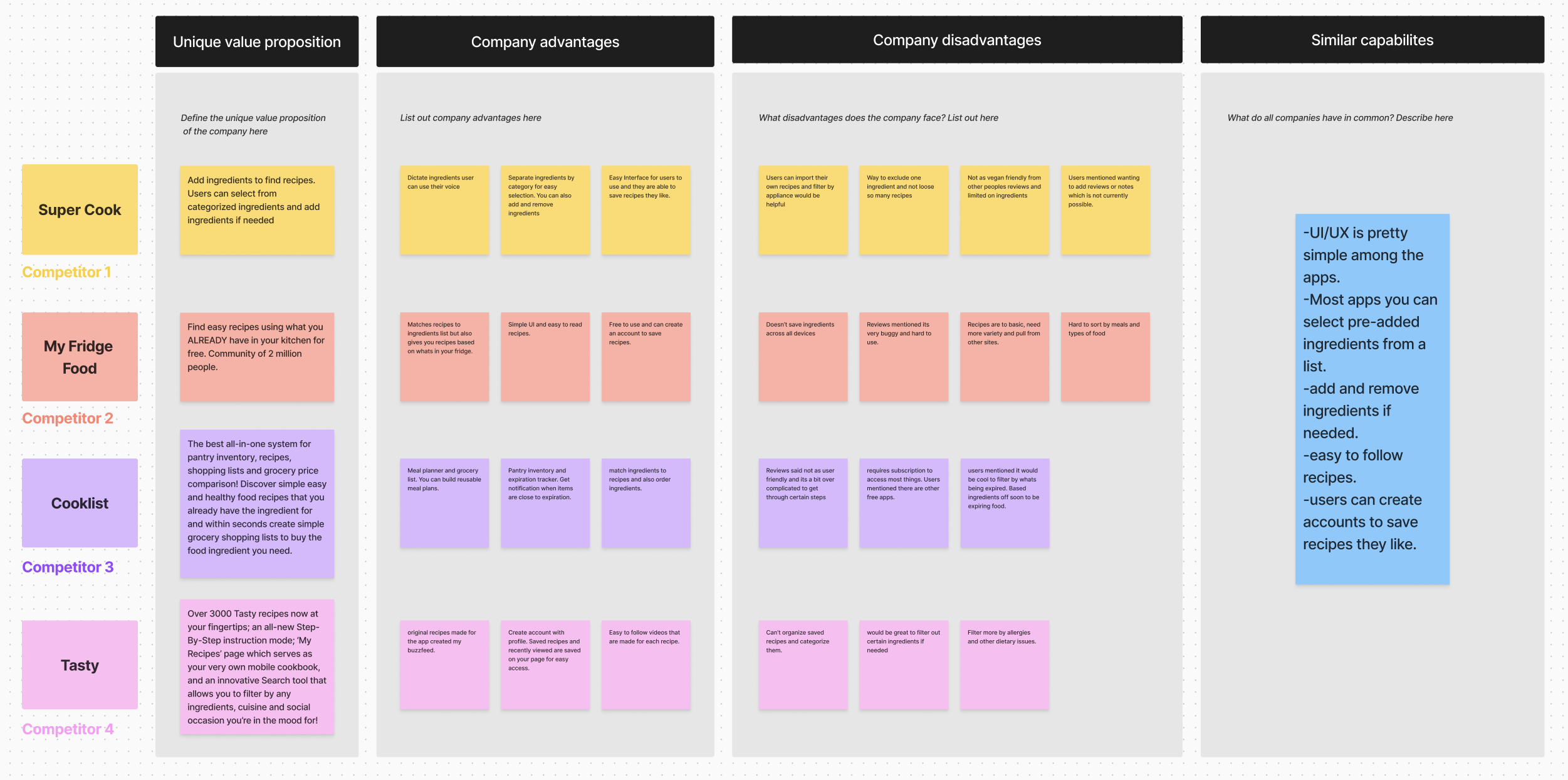
After doing some initial research I was able to find some apps and websites geared towards helping users create new recipes based off ingredients. I created a competitive analysis graph to compare each app. The apps I found mainly focused on finding ingredients based off of recipes, pantry inventory, and create grocery list.
Primary Research
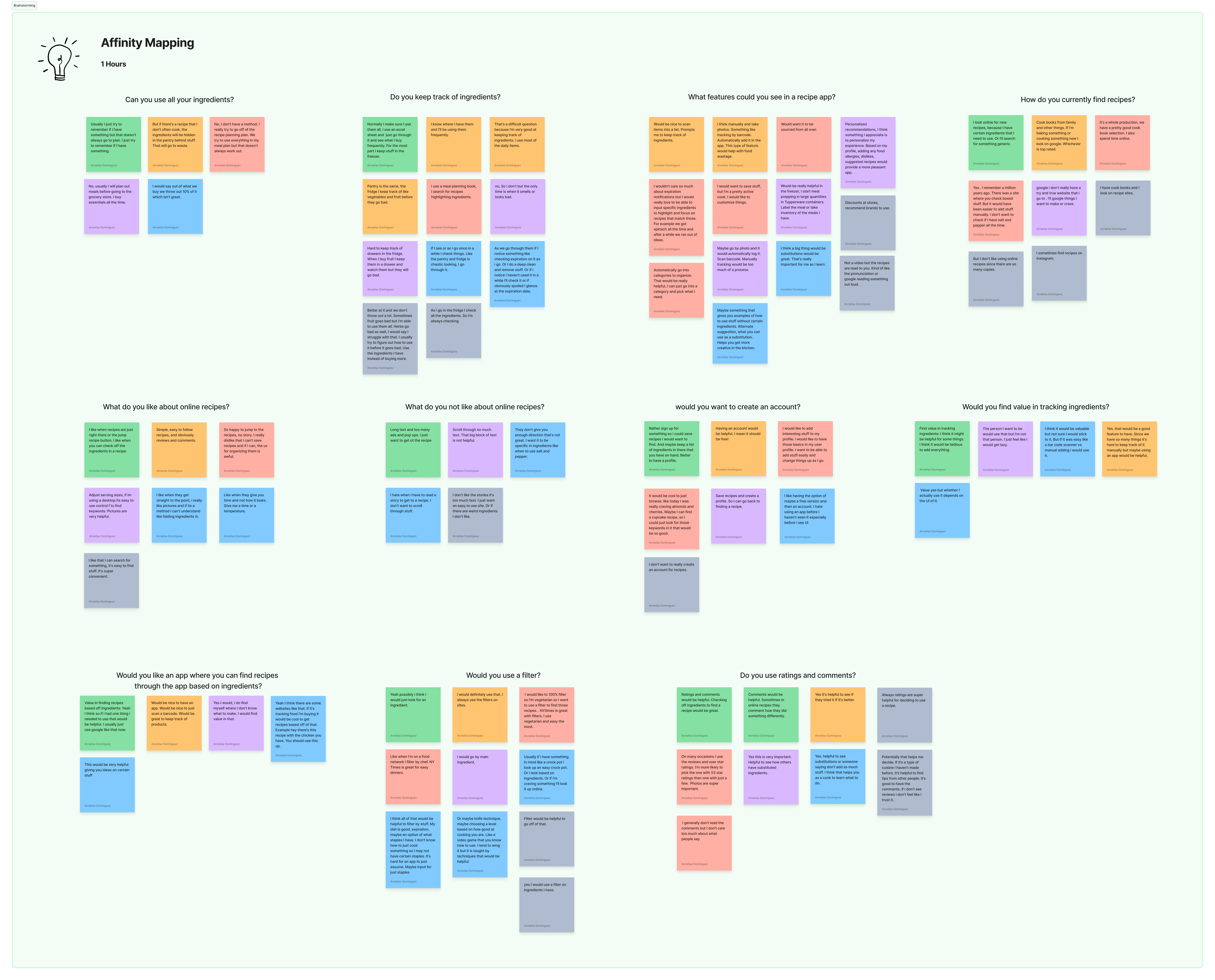
I was able to interview 6 adults who are either new to cooking or cook all the time. After the interviews I created an Affinity Map to and created groupings of the findings. This helped me figure out what features of the app the user finds most important.
Define
The Problems
Some of the main pain points I identified from the data influenced the direction of the project. Notably, during the interviews, I observed several key issues, including:
- Users overwhelmed with the thought of cooking if they are new to it or struggle with it.
- Users don’t know what to do with ingredients they already have in the kitchen.
- Users struggle with using all ingredients before they expire.
Persona
Based on the data I collected, I developed a persona that represents the collective insights from all participants. The “aspiring home chef” emerged as the most fitting embodiment, reflecting a user who seeks to simplify their kitchen experience.
With the persona established, I used the insights to craft POV (Point of View) statements and HMW (How Might We) questions to steer the project’s direction effectively.

The Solution
The goal of the project is to develop a solution that enhances users’ enjoyment of cooking and helps them discover new recipes. By enabling users to find recipes based on the ingredients they have, the solution aims to minimize food waste and ensure all ingredients are used effectively.
Ideate
Information Architecture
Feature Roadmap
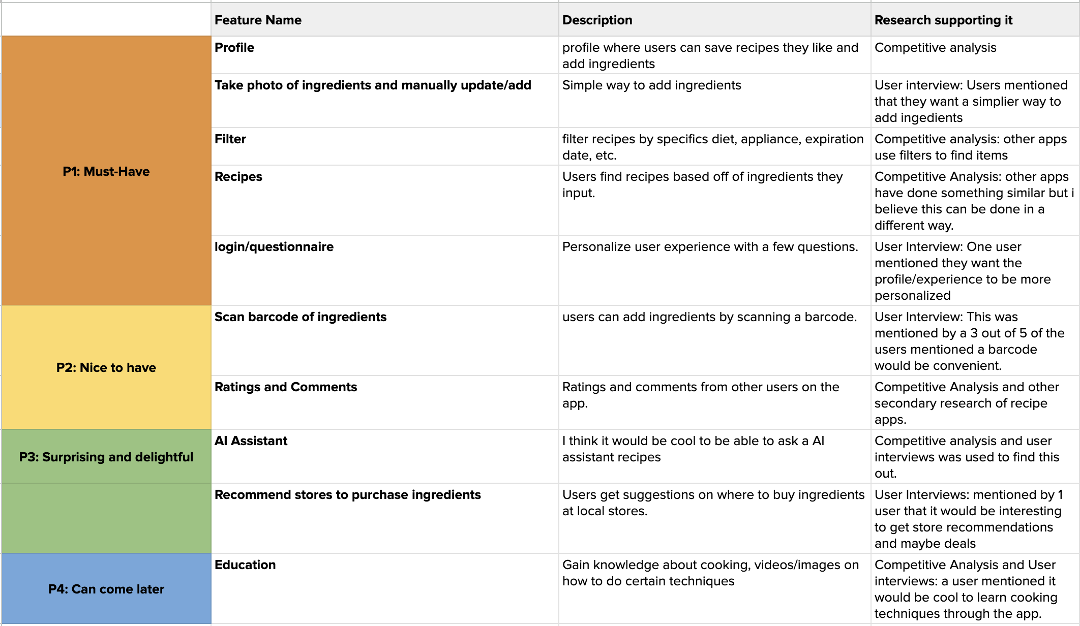
Once my research was complete, I developed a strategic plan for the app. I created a feature roadmap outlining essential elements, desirable enhancements, and potential future additions. The key focus areas included a profile page, a photo page, an ingredients page with filtering capabilities, and an AI assistant.
Site Map
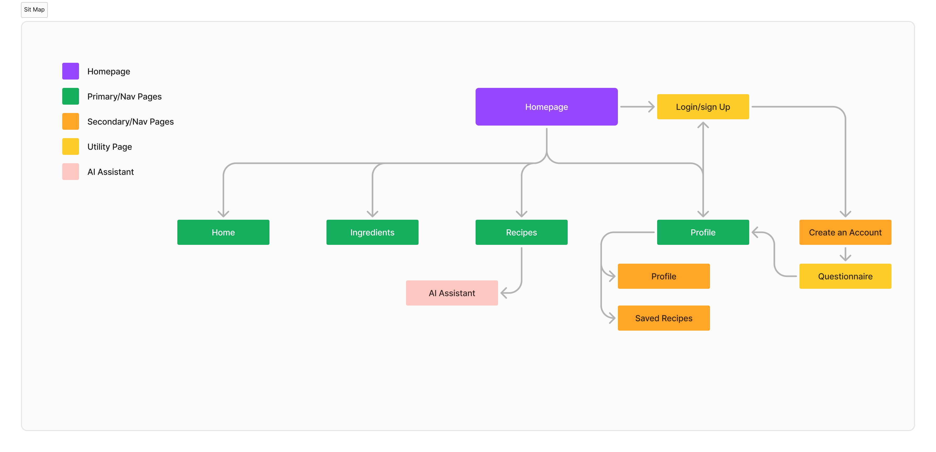
From user interviews and research I was able to figure out the main purpose of this app. I wanted to keep it simple and create a simple site map for the site.
User Flows
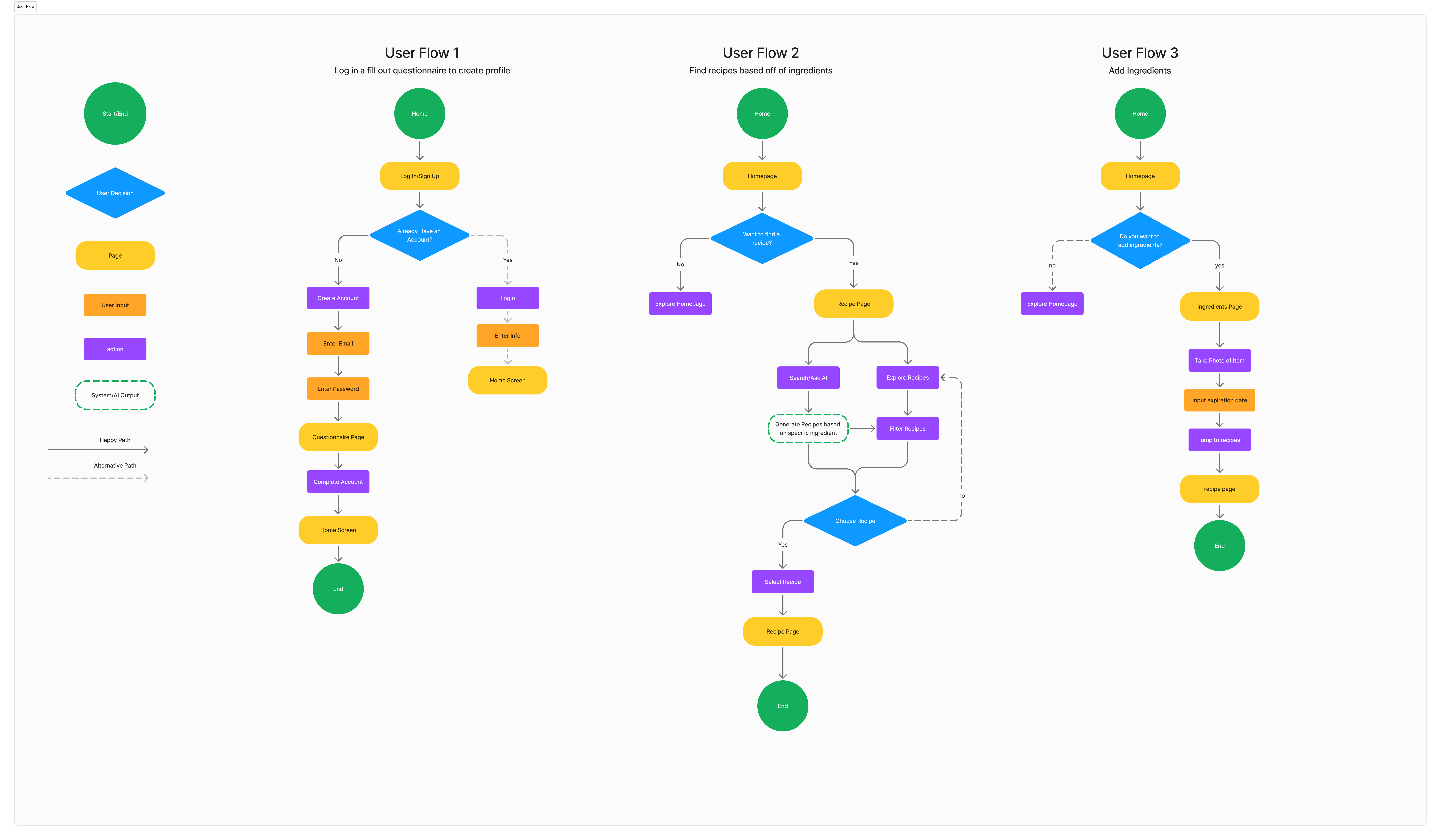
After creating a site map I was then able to start thinking of my user flow and how that would look. The first initial flows I created were logging in for the first time, finding a recipe based off of ingredients, and adding new ingredients.
Wireframes
Low Fidelity
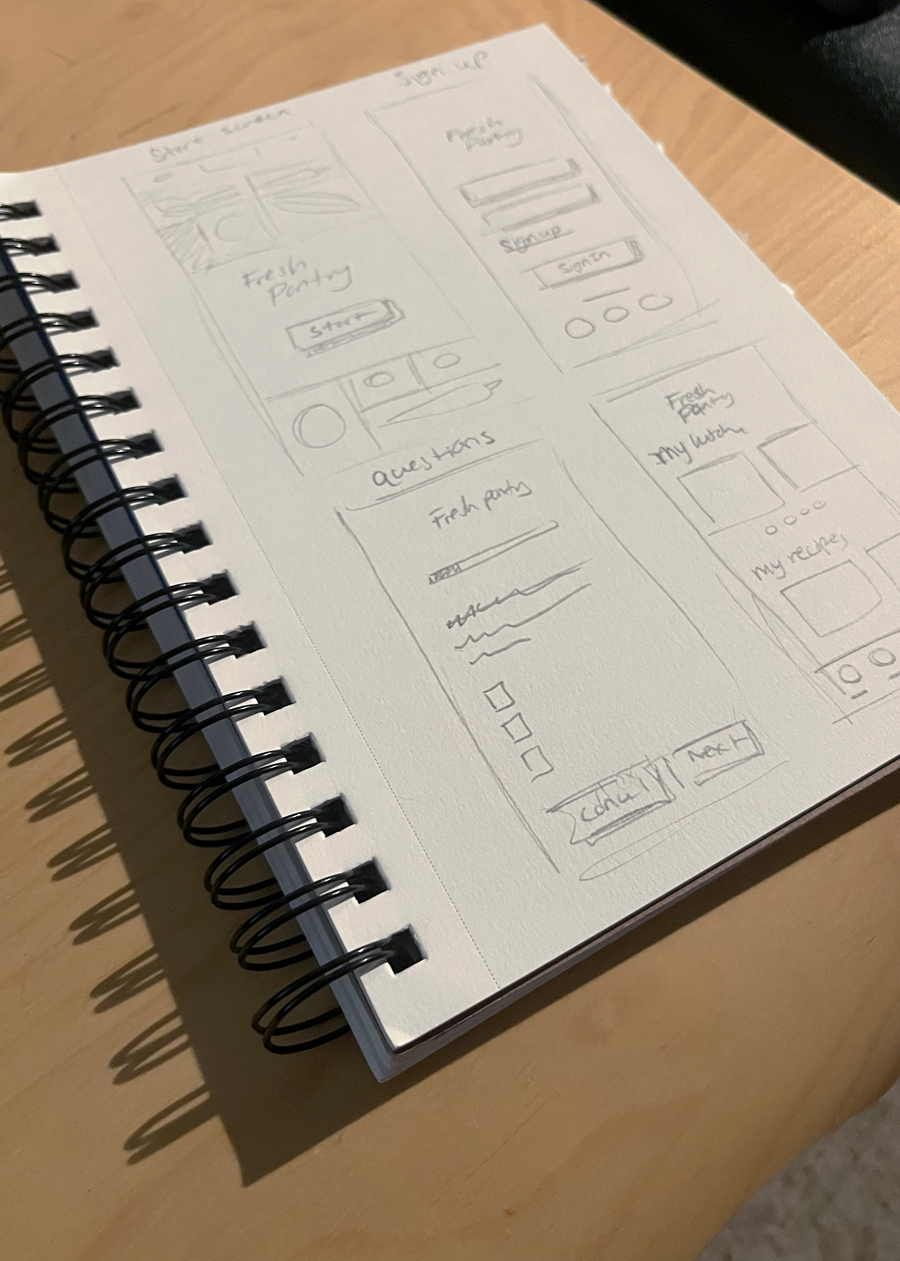
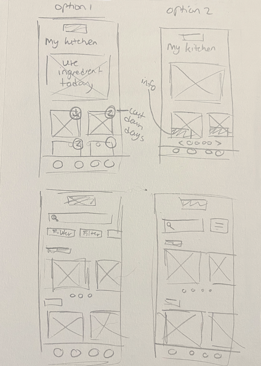
After going through the steps to create my site map, and user flows I was ready to begin early sketches. These show a couple of the screens I initially started out with based off of my flows. My main focus was the sign up process, how a user adds ingredients, the homepage and the account page.
Sign Up Process
Home/My Kitchen
Mid-Fidelity
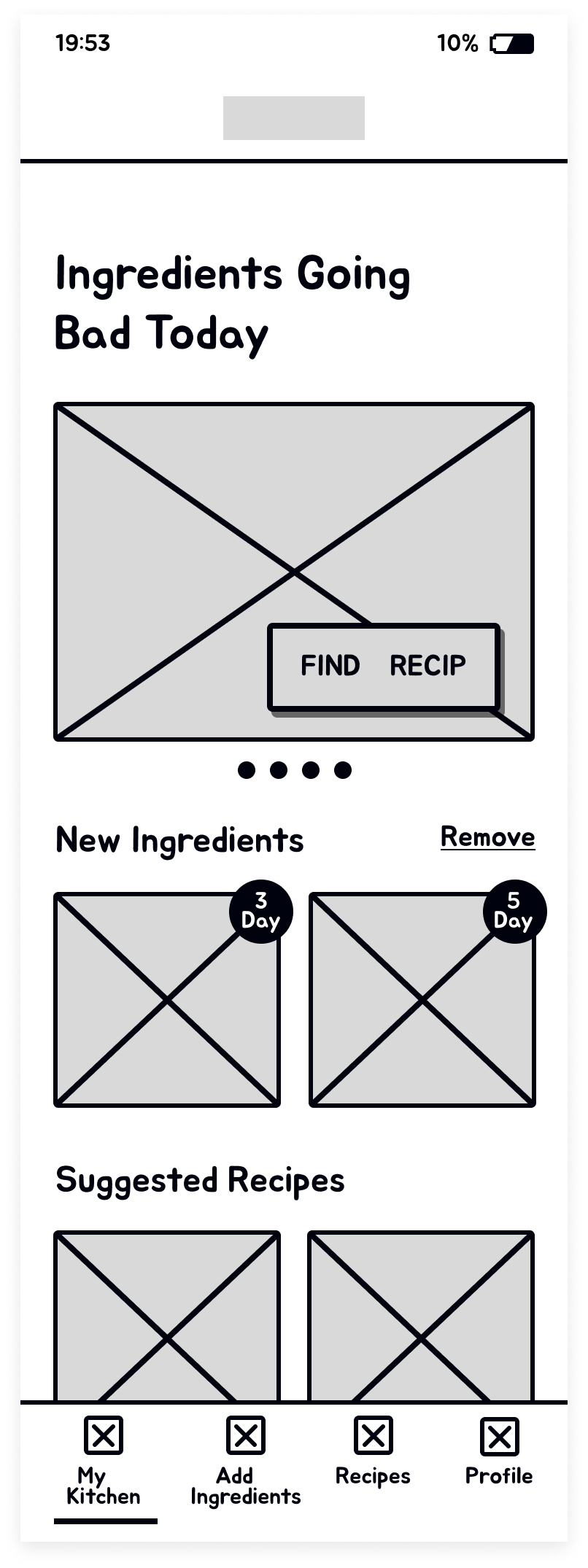
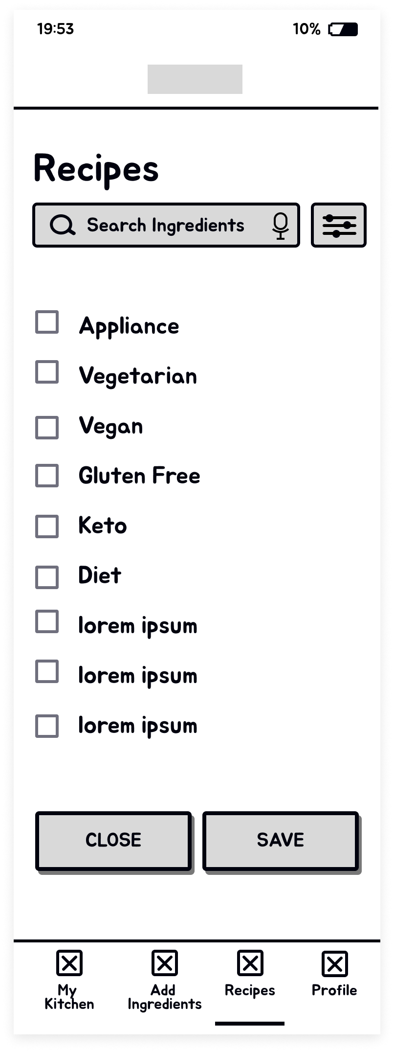
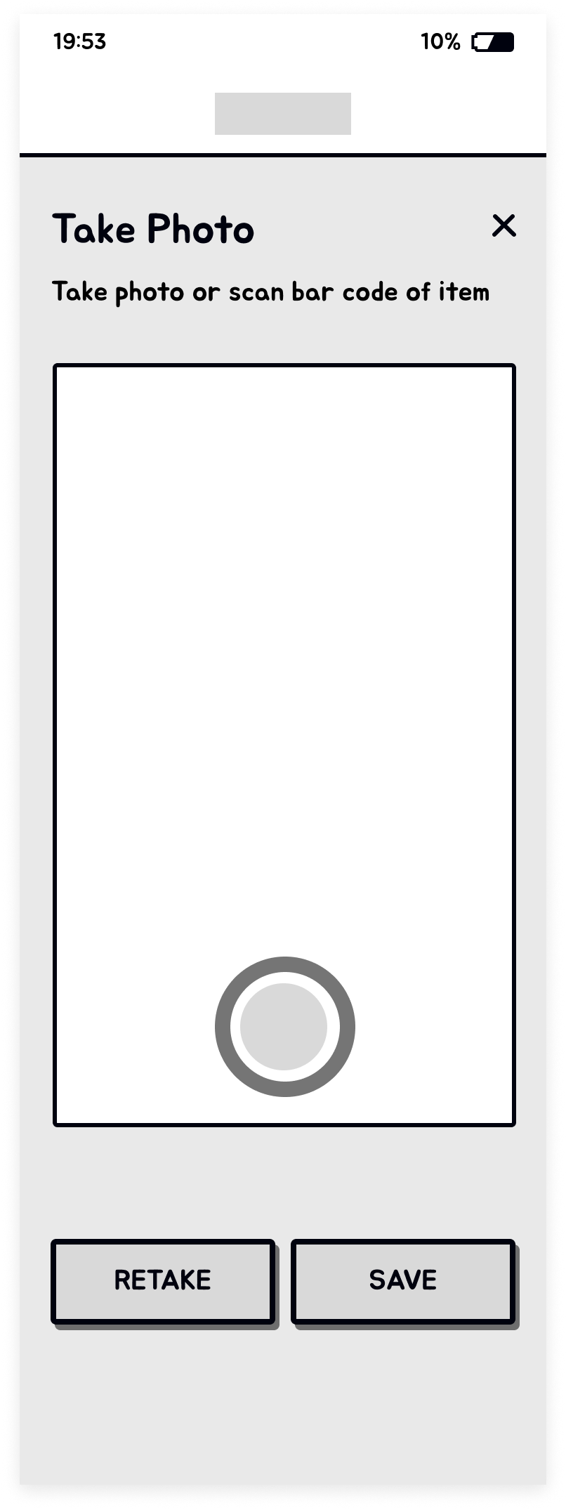
I used my initial sketches to develop mid-fidelity wireframes, keeping them simple and clean with ample whitespace.
Homepage
Recipe Page

Recipe Filter
Photo
UI Design
Branding
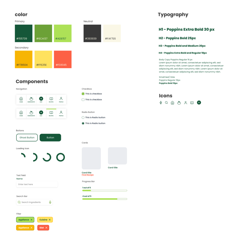
Starting off with the branding of the site. What I want the site to come across as is a fun, simplistic, creative, and helpful. The app is able to help a user with learning new recipes and how to cook while also helping them keep track of ingredients.
UI Design Toolkit
As I created the brand for Fresh Pantry I wanted to keep the colors organic and earthy, but also very bright. My primary colors were focused on greens with bright secondary colors in the red and orange hues.
I also chose the typeface Poppins for this app because of the simplicity and roundness of the typeface. I think its very clean and fun which fits the brand well.
High Fidelity
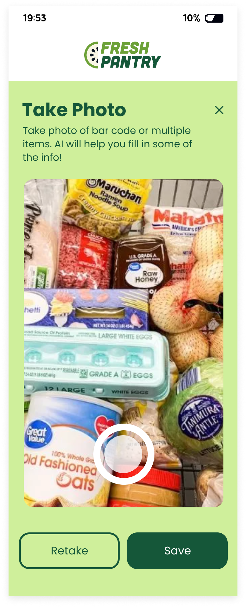
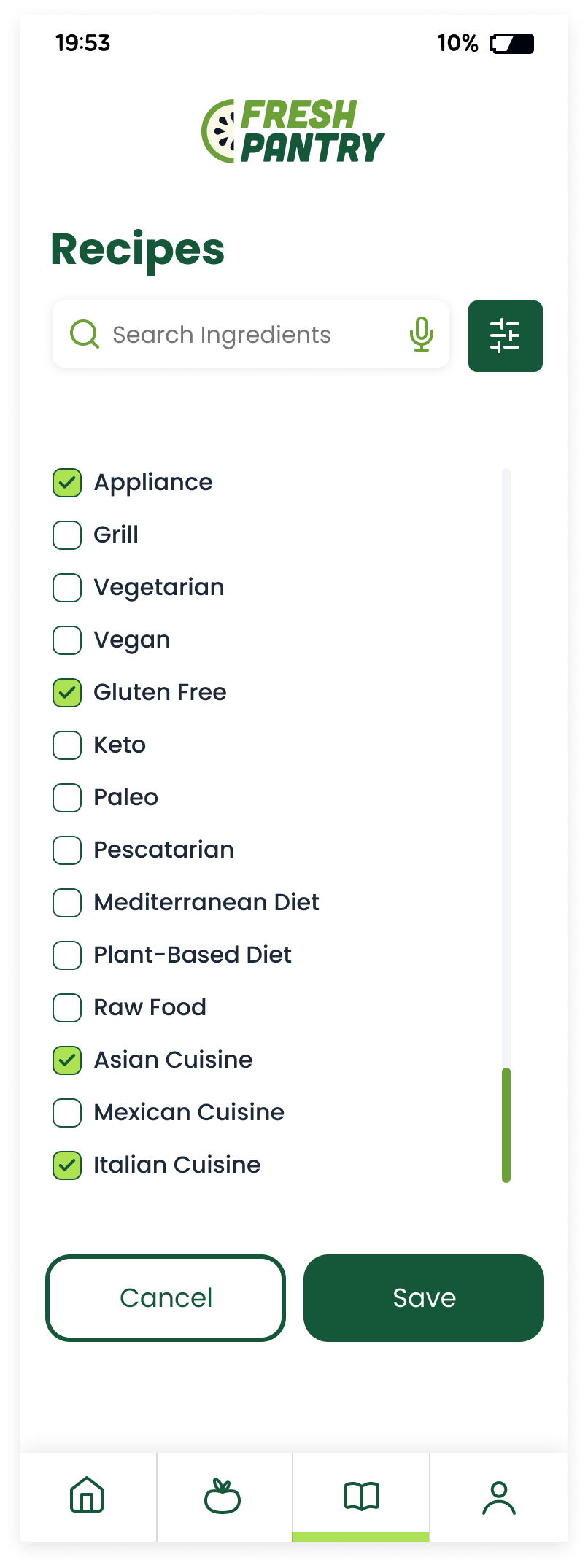
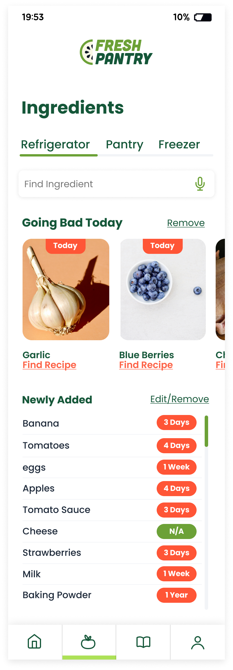
For the high-fidelity wireframes, I incorporated the primary green colors with accents of secondary colors. I maintained a simple and clean UI, utilizing ample white space to enhance clarity. Additionally, I selected clean, high-quality photography to complement the design.
Homepage

Photo
Recipe Filters
Ingredients Page
Prototype & Test
Usability Test
I received valuable feedback from the usability tests which helped me identify the most critical areas to focus on for updates. All five users found the flow to be fairly easy, rating it on a scale from 1 (difficult) to 5 (easy). The average rating was 4.0, with four out of the five users rating it as such. One user rated it differently.
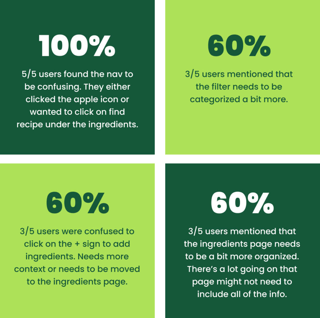
- Participants: 5
- Time: around 15 mins for each participant to run through all two task. About 3 mins each
- 3 females 20’s to 30’s
- 2 males 20’s to 30’s
Final Design
After reviewing all the feedback, I focused on addressing the key issues users encountered, including the ingredients page layout, navigation, recipe filter, photo capture page and added ingredients page. This feedback guided me in refining the design, leading to the enhanced version you see here.
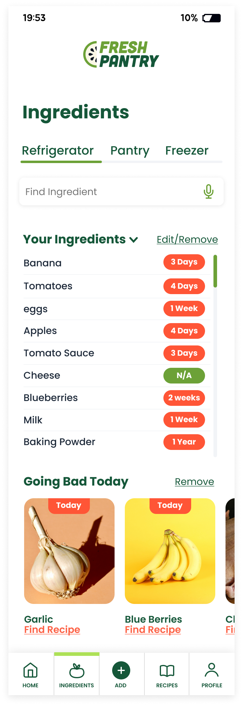
Original Ingredients Page
The primary issue was that users felt overwhelmed by the information, and they also found the main navigation confusing.

Revision
I added a feature that allows users to quickly review ingredient information with a single click. Additionally, the main navigation has been made clearer.
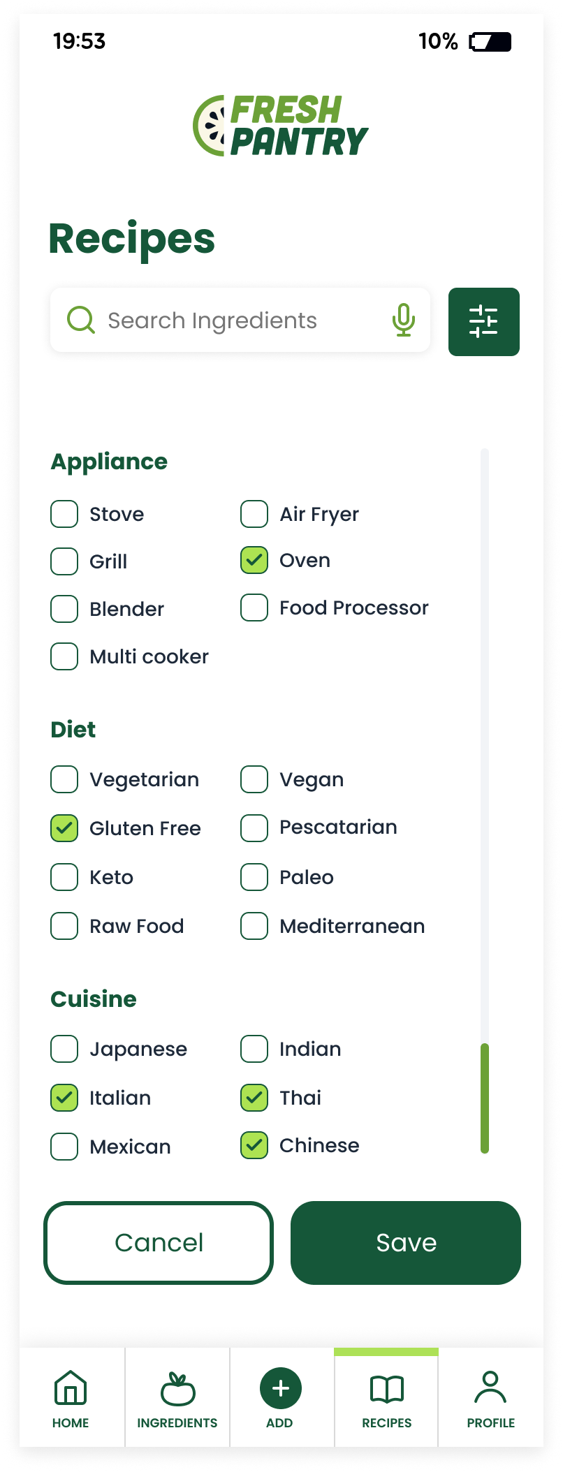
Original Filter
The original filter was easy to locate, but it was problematic because it didn’t function effectively. Users wanted a clearer filter.

Revision
I clarified the filter by breaking it into categories that better assist users. This improved organization makes it easier for users to select what they need.
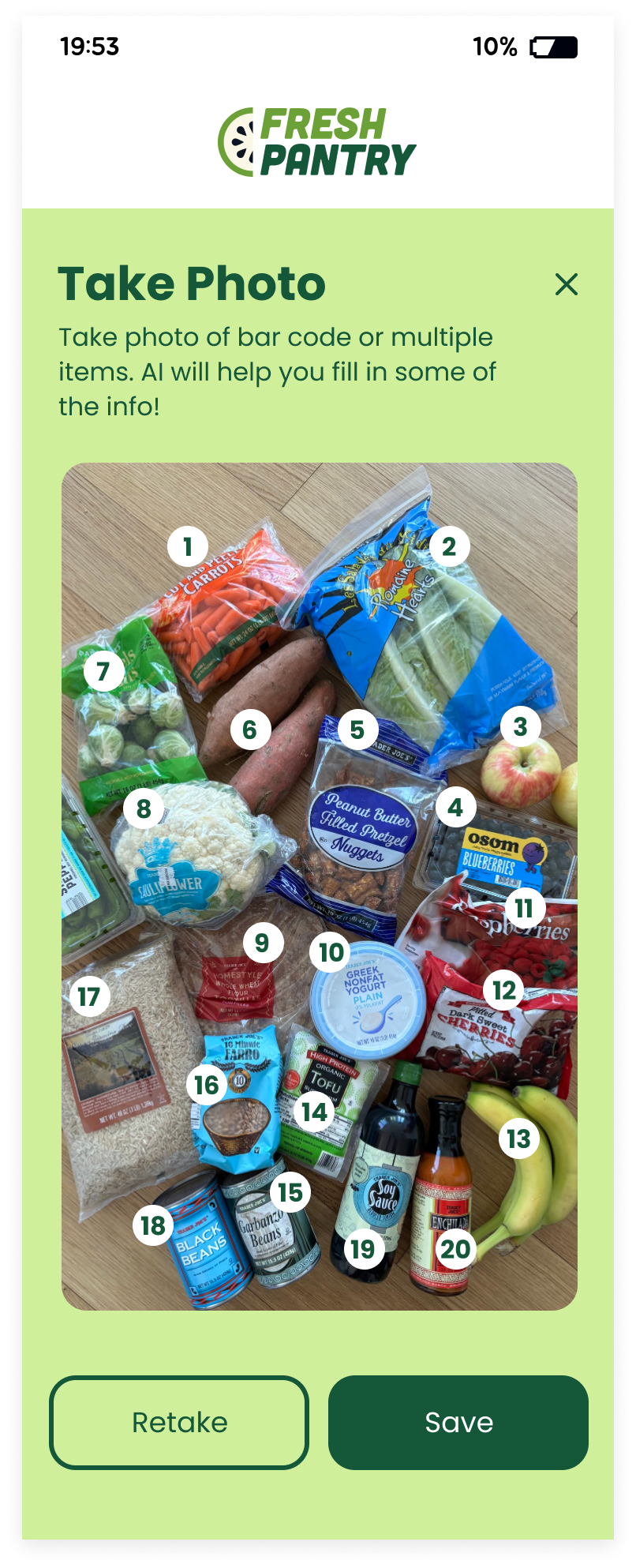
Original Photo Page
The original photo page quickly captured a photo and used A.I. to identify ingredients and products. Users requested the ability to photograph everything in one go.

Revision
During usability testing, users suggested that after taking a photo, the A.I. should display the counted items before moving to the ingredients page, as shown on the right revision.
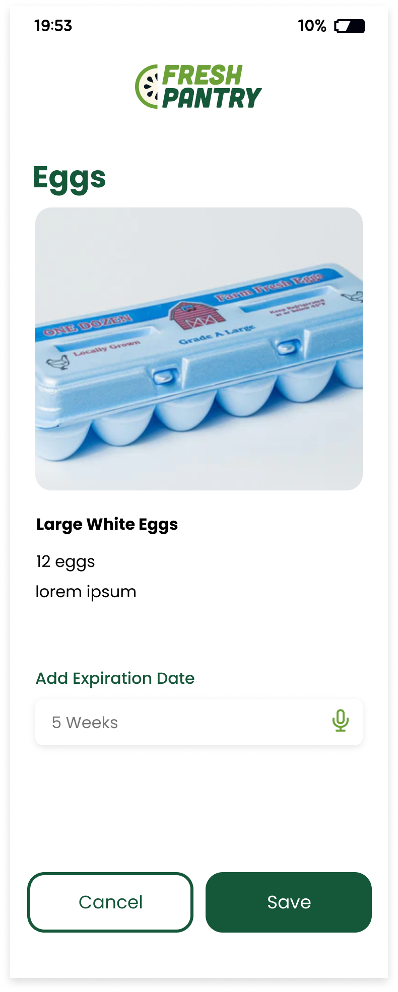
Original Added Ingredient
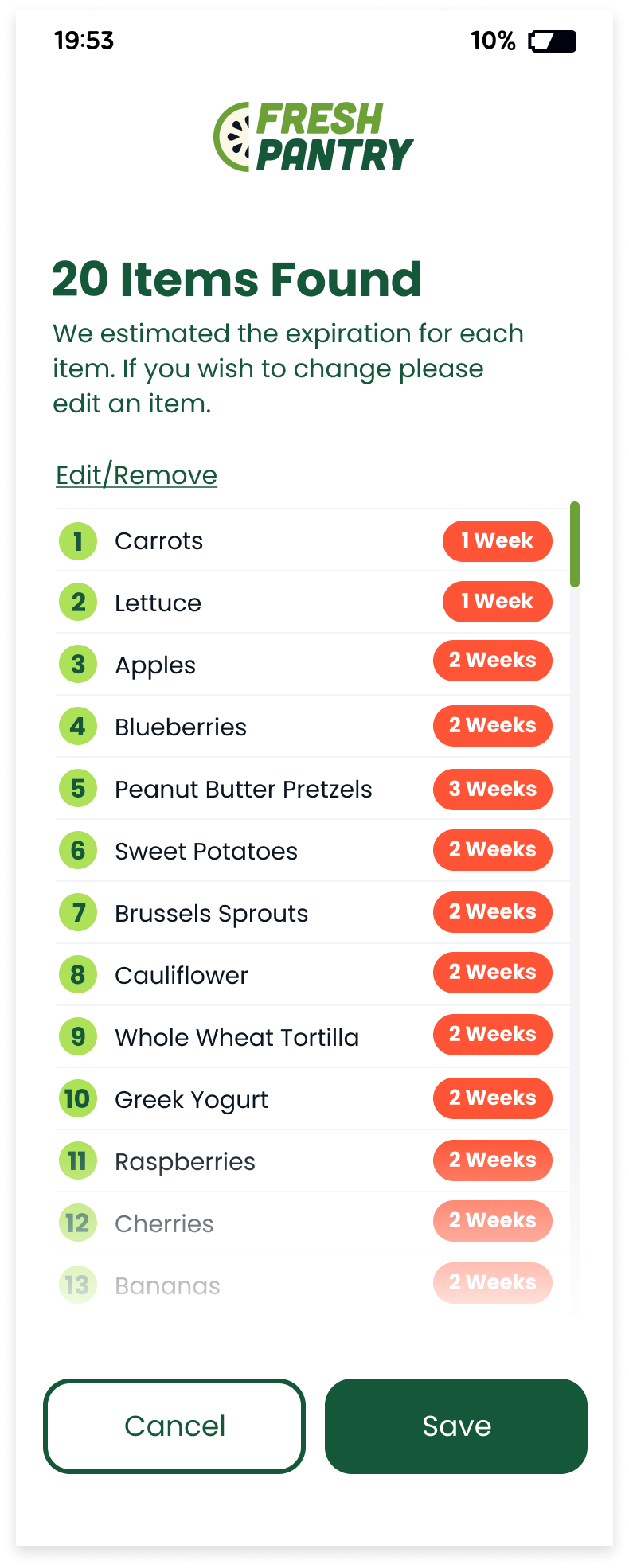
Originally, after taking a photo, users could scroll through ingredients and add expiration dates. Testing revealed that a list view would be more intuitive.
Revision
To address user feedback, I created a list view linked to the photo and added AI-suggested expiration dates, which users can edit if needed.
Reflection
This project significantly contributed to my growth as a UX designer by presenting a substantial challenge and offering an opportunity to grasp core UX/UI principles. I particularly enjoyed creating something from scratch, inspired by the need to make a dessert with available ingredients, which led me to devise a solution for users to generate recipes based on what they have. The main challenge was narrowing down the idea and focusing on key features amidst numerous possibilities. I discovered that many people struggle with using up all their ingredients, which guided my design decisions based on user feedback. To ensure my design met user needs, I analyzed interview insights and identified common themes during affinity mapping. I had to make trade-offs by prioritizing essential features due to time constraints, but I plan to expand the app further in the future. A key takeaway is the importance of thorough research to ensure that the design aligns with genuine user needs rather than just a concept.
